Creating graphics with ggplot2

Practical Computing and Data Science Tools

Annoucements

  • Midterm II is Thursday, November 14th, during lab time.
  • Material on the midterm will include all material through Week 11 (this week!).
  • The midterm will be of similar form to the last midterm.
  • Closed materials, but you are allowed one 8.5” x 11” sheet of paper, double-sided, hand-written note sheet.

Agenda

  • Components of a graphic (i.e. the grammar of graphics)
  • Composing a graphic

Components of a graphic

What is a graphic made up of?
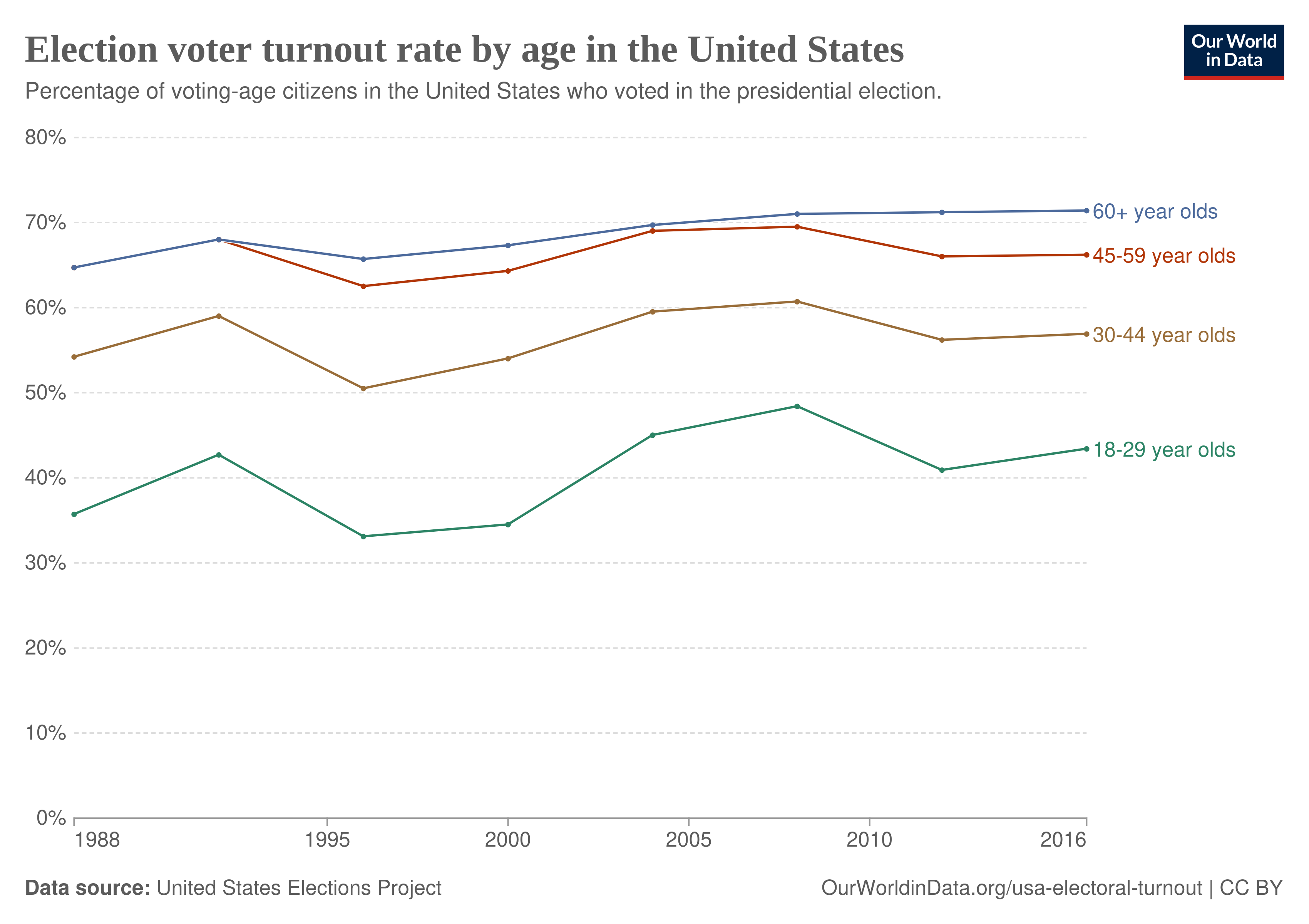
What is a graphic made up of?

  • Data, and
  • Visual components

Data

That graphics we will create use data in the same form as we have seen thus far in the course.

In other words, we will use tibbles to create graphics

Data

What might the rows and columns of the tibble used to create this graphic be?

Visual components

In order to create a graphic or “plot”, one must choose visualize the variables of the data to the attributes of the plot. Further, one must choose the cosmetic properties of the plot.

Layers can be specified as a variety of components:

  • geom: the geometric shape that the data are mapped to,
    • Examples: point, line, bar, text, path, …
  • aesthetics: The visual properties of the geom.
    • Examples: x-position, y-position, color, fill, shape
  • coord: coordinate system,
    • Examples: Cartesian, polar, lon/lat projection
  • scale: how data are mapped to certain aesthetics.
    • Example: which colors or shapes to use?
  • facet: a technique to split plots into multiple panels,
  • themes: the cosmetic attributes of the plot.

Visual components

What are the visual components used in this graphic? (geoms, aesthetics, coords, scale, facets, themes)

Composing a graphic

Consider the fef dataset

library(tidyverse)
fef <- read_csv("../labs/datasets/FEF_trees.csv")
fef
# A tibble: 88 × 18
   watershed  year  plot species     dbh_in height_ft stem_green_kg top_green_kg
       <dbl> <dbl> <dbl> <chr>        <dbl>     <dbl>         <dbl>        <dbl>
 1         3  1991    29 Acer rubrum    6        48            92.2         13.1
 2         3  1991    33 Acer rubrum    6.9      48           102.          23.1
 3         3  1991    35 Acer rubrum    6.4      48           124.           8.7
 4         3  1991    39 Acer rubrum    6.5      49            91.7         39  
 5         3  1991    44 Acer rubrum    7.2      51           186.           8.9
 6         3  1992    26 Acer rubrum    3.1      40            20.8          0.9
 7         3  1992    26 Acer rubrum    2        30.5           5.6          0.9
 8         3  1992    26 Acer rubrum    4.1      50            54.1          8.6
 9         3  1992    48 Acer rubrum    2.4      28            10.2          0.7
10         3  1992    48 Acer rubrum    2.7      40.4          20.2          5  
# ℹ 78 more rows
# ℹ 10 more variables: smbranch_green_kg <dbl>, lgbranch_green_kg <dbl>,
#   allwoody_green_kg <dbl>, leaves_green_kg <dbl>, stem_dry_kg <dbl>,
#   top_dry_kg <dbl>, smbranch_dry_kg <dbl>, lgbranch_dry_kg <dbl>,
#   allwoody_dry_kg <dbl>, leaves_dry_kg <dbl>

Let’s create a plot

First, our canvas:

ggplot()

Let’s create a plot

Then, we specify the data:

ggplot(data = fef)

Let’s create a plot

Question: why is this still blank?

ggplot(data = fef)

Let’s create a plot

Answer: we need to specify aesthetic mappings!

ggplot(data = fef, mapping = aes(x = species, y = dbh_in))

Let’s create a plot

We’ve now specified that “species” will be mapped to the x-axis, and “dbh_in” will be mapped to the y-axis.

  • But we still haven’t specified what geometry to map these aesthetic attributes to.
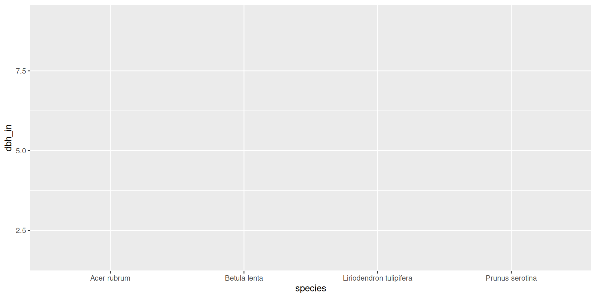
ggplot(data = fef, mapping = aes(x = species, y = dbh_in))

Let’s create a plot

We’ve now specified that we will map these aesthetics to “points”.

ggplot(data = fef, mapping = aes(x = species, y = dbh_in)) +
  geom_point()

Let’s create a plot

You can also specify the aesthetic mapping in the geometry layer:

ggplot(data = fef) +
  geom_point(mapping = aes(x = species, y = dbh_in))

Let’s create a plot

Let’s take a look at other geometric objects we could map aesthetics to:
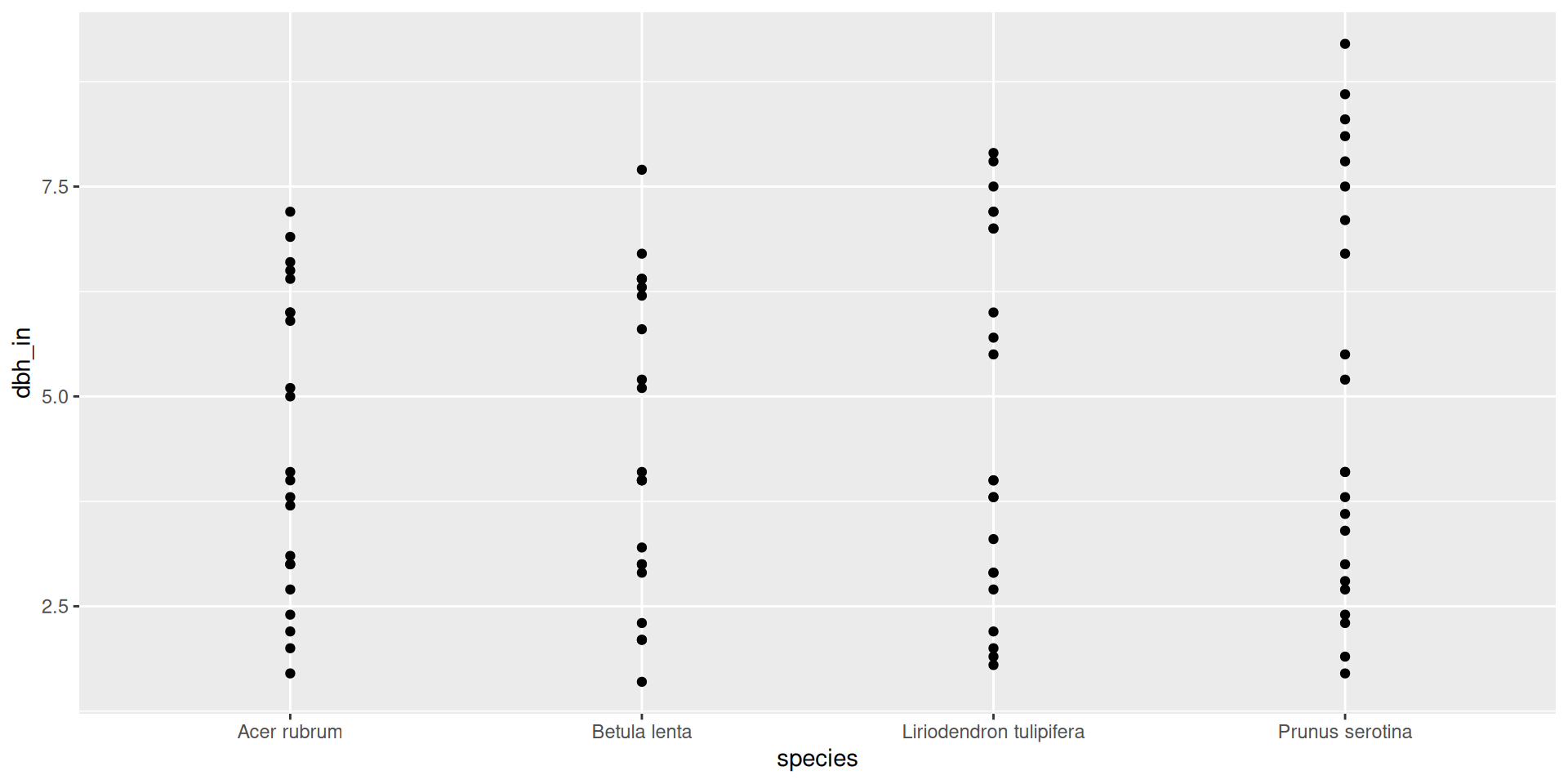
ggplot(data = fef) +
  geom_point(mapping = aes(x = species, y = dbh_in))

Let’s create a plot

Let’s take a look at other geometric objects we could map aesthetics to:
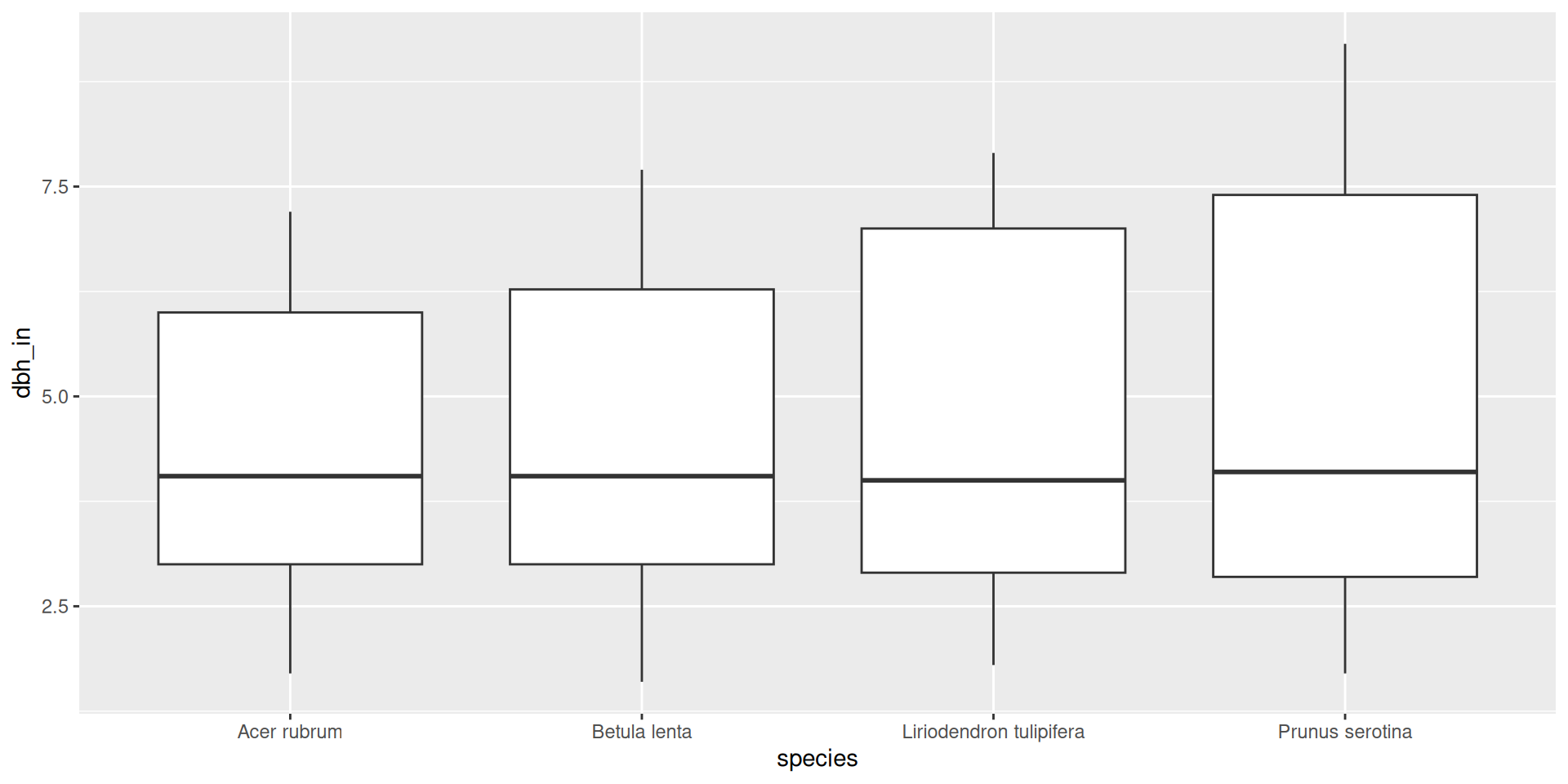
ggplot(data = fef) +
  geom_boxplot(mapping = aes(x = species, y = dbh_in))

Let’s create a plot

Let’s take a look at other geometric objects we could map aesthetics to:
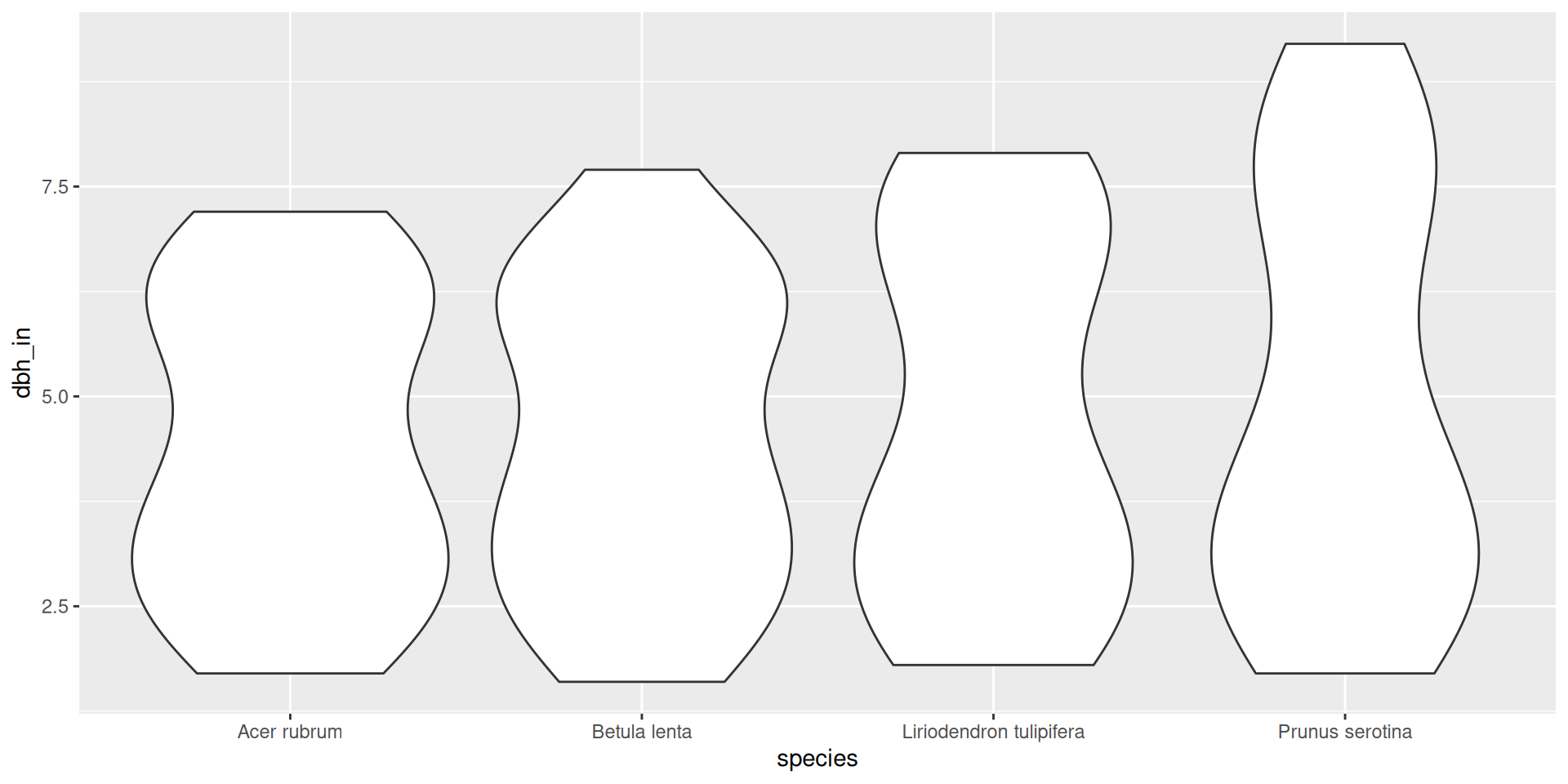
ggplot(data = fef) +
  geom_violin(mapping = aes(x = species, y = dbh_in))

Let’s create a plot

We can also add layers on top of each other

ggplot(data = fef, mapping = aes(x = species, y = dbh_in)) +
  geom_violin() +
  geom_point()

Let’s create a plot

Note here that I moved the mapping back to ggplot(): “inheriting aesthetics”
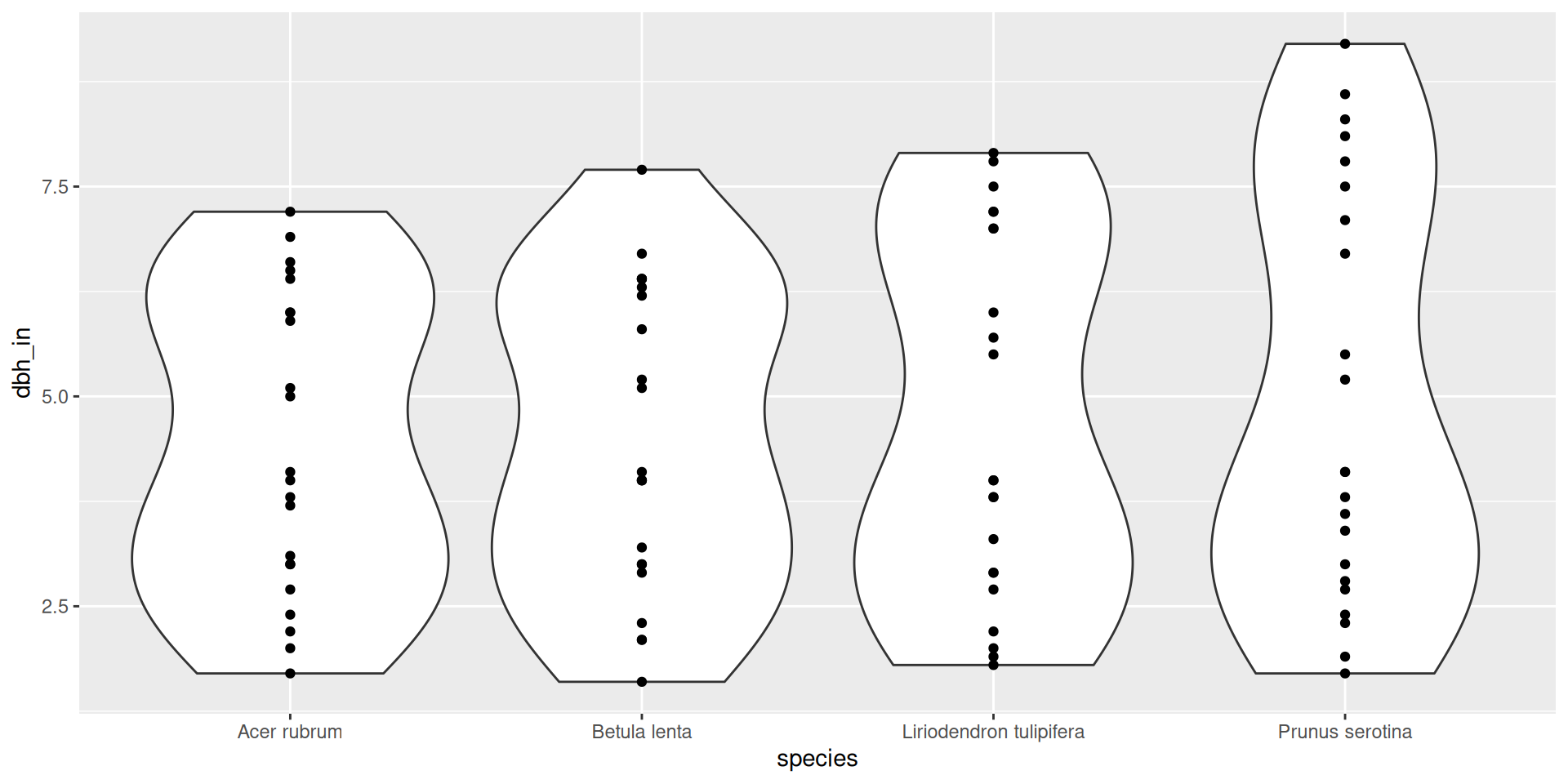
ggplot(data = fef, mapping = aes(x = species, y = dbh_in)) +
  geom_violin() +
  geom_point()

A different plot: what are the mappings?
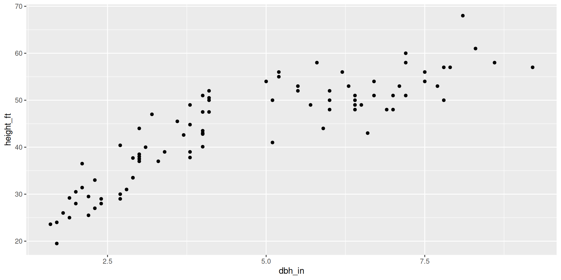
ggplot(data = fef, mapping = aes(x = dbh_in, y = height_ft)) +
  geom_point()

A different plot: what are the mappings?
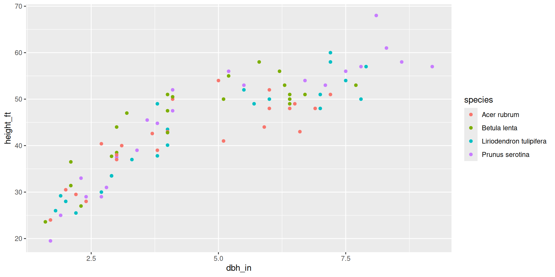
ggplot(data = fef, mapping = aes(x = dbh_in,
                                 y = height_ft,
                                 color = species)) +
  geom_point()

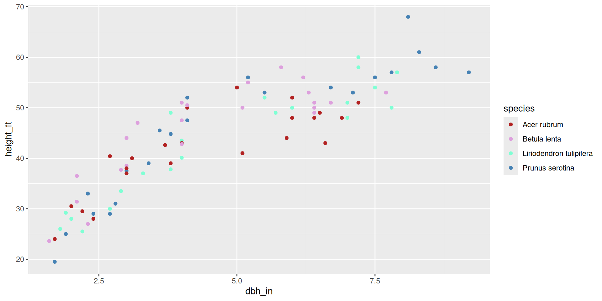
Modifying the scale: changing colors

ggplot(data = fef, mapping = aes(x = dbh_in,
                                 y = height_ft,
                                 color = species)) +
  geom_point() + 
  scale_color_manual(values = c("firebrick", "plum","aquamarine", "steelblue"))

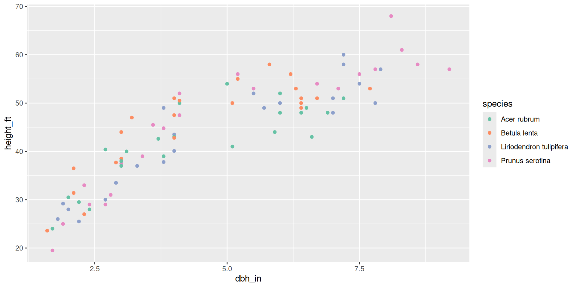
Modifying the scale: changing colors

ggplot(data = fef, mapping = aes(x = dbh_in,
                                 y = height_ft,
                                 color = species)) +
  geom_point() + 
  scale_color_brewer(palette = "Set2")

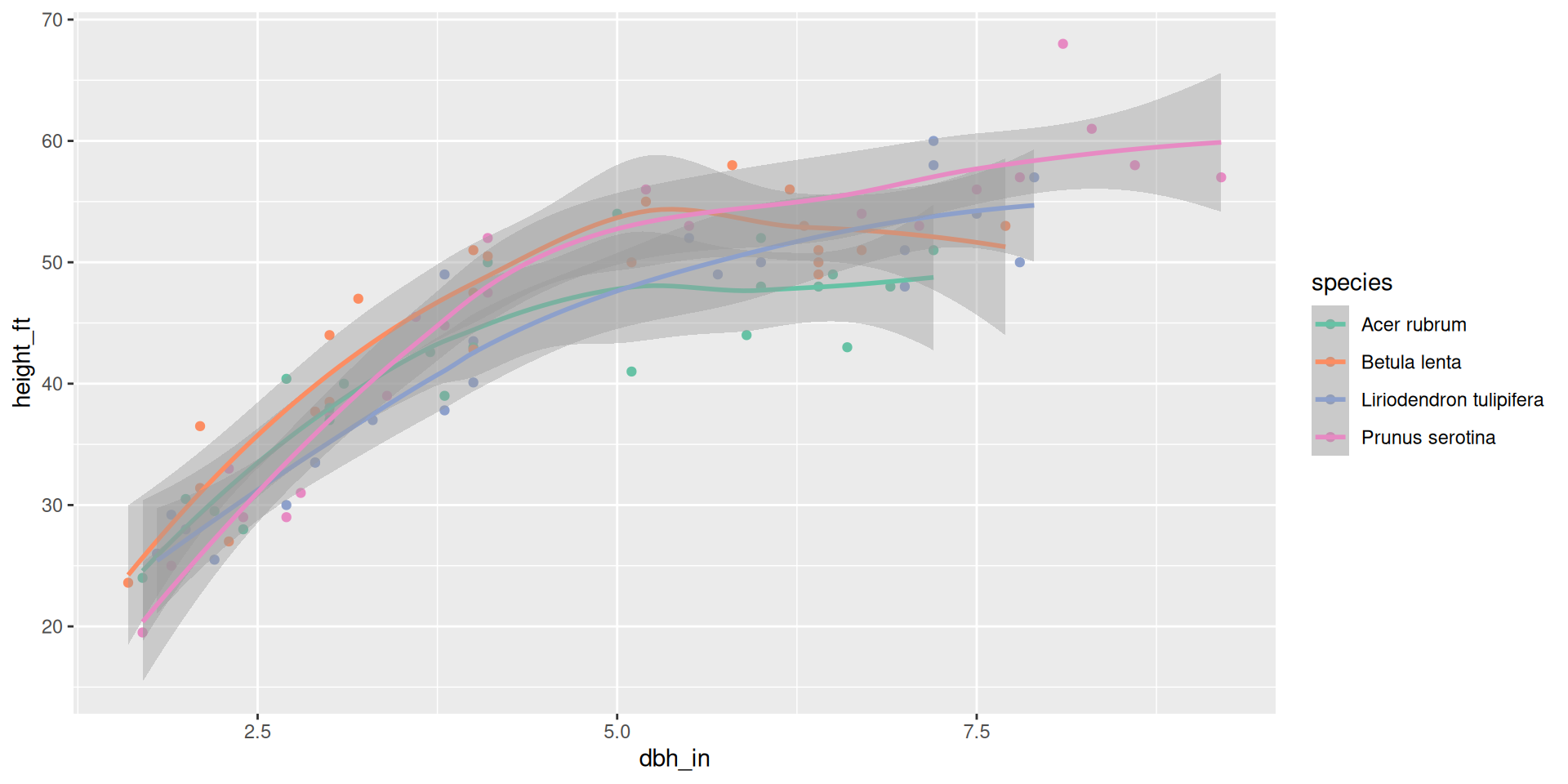
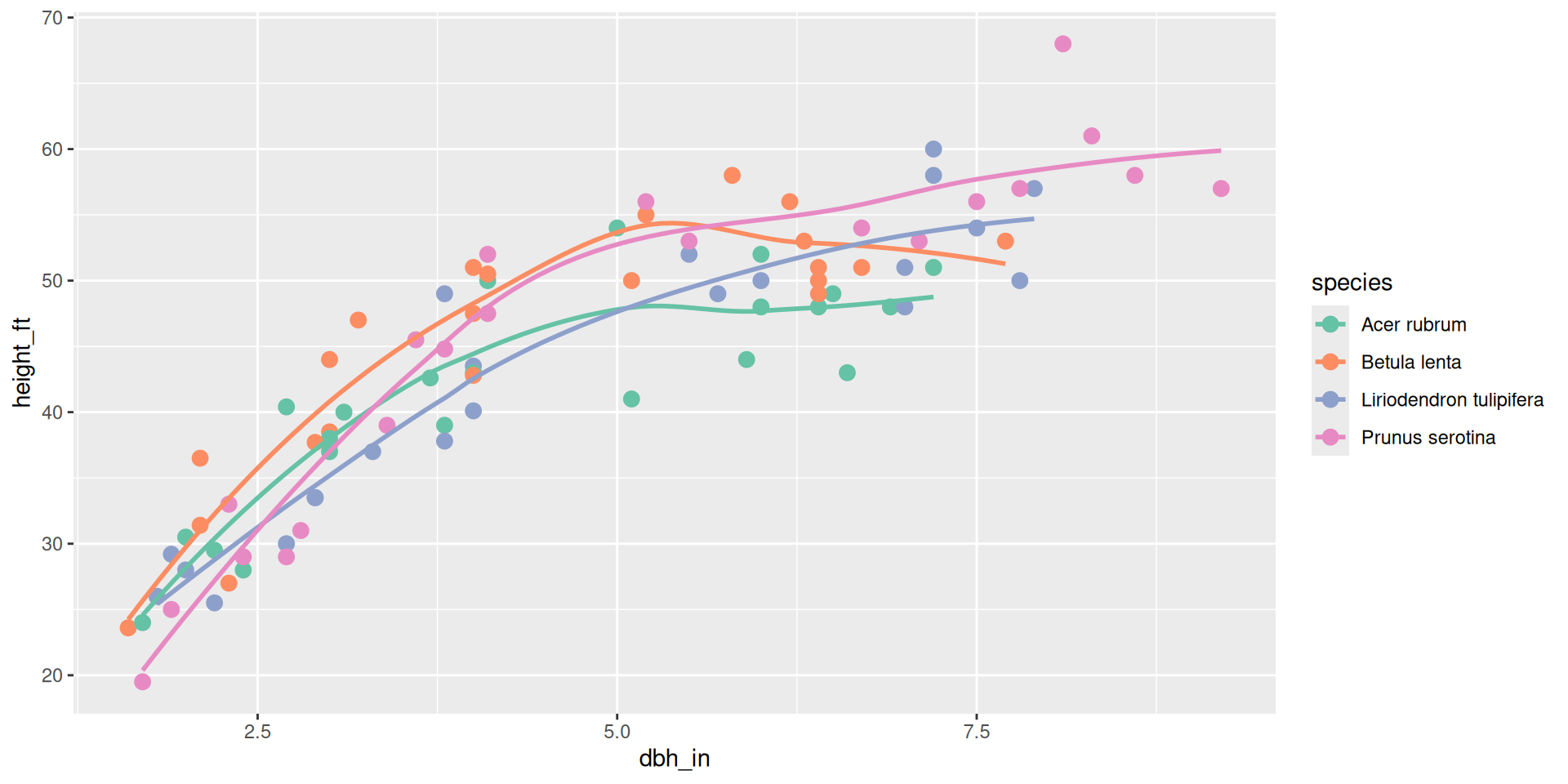
Adding another layer: smoothing line

ggplot(data = fef, mapping = aes(x = dbh_in,
                                 y = height_ft,
                                 color = species)) +
  geom_point() + 
  geom_smooth() +
  scale_color_brewer(palette = "Set2")

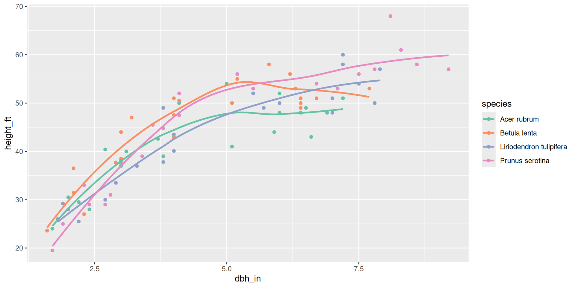
Adding another layer: smoothing line

ggplot(data = fef, mapping = aes(x = dbh_in,
                                 y = height_ft,
                                 color = species)) +
  geom_point() + 
  geom_smooth(se = FALSE) +
  scale_color_brewer(palette = "Set2")

Changing the size mapping

ggplot(data = fef, mapping = aes(x = dbh_in,
                                 y = height_ft,
                                 color = species)) +
  geom_point(size = 3) + 
  geom_smooth(se = FALSE) +
  scale_color_brewer(palette = "Set2")

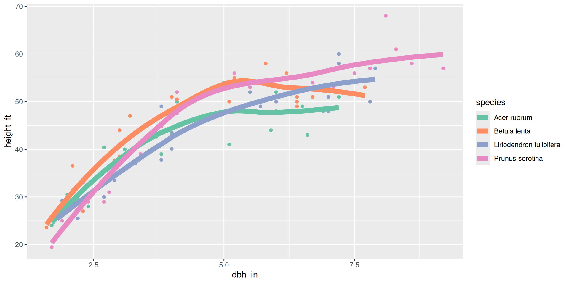
Changing the size mapping

ggplot(data = fef, mapping = aes(x = dbh_in,
                                 y = height_ft,
                                 color = species)) +
  geom_point() + 
  geom_smooth(se = FALSE, linewidth = 3) +
  scale_color_brewer(palette = "Set2")

A different way to look by species: facets
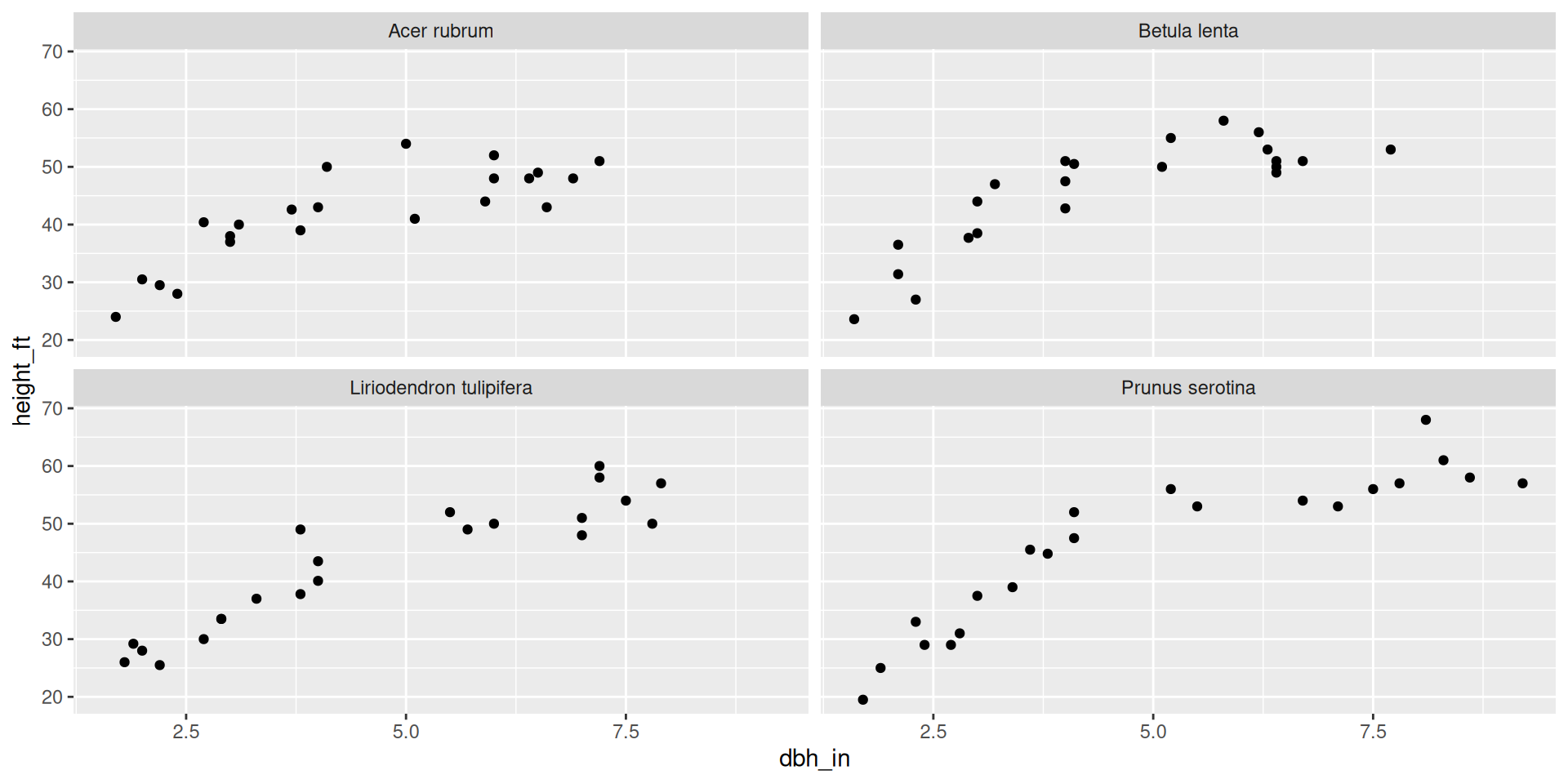
ggplot(data = fef, mapping = aes(x = dbh_in,
                                 y = height_ft)) +
  geom_point() +
  facet_wrap(~species)

Changing the number of rows of facets
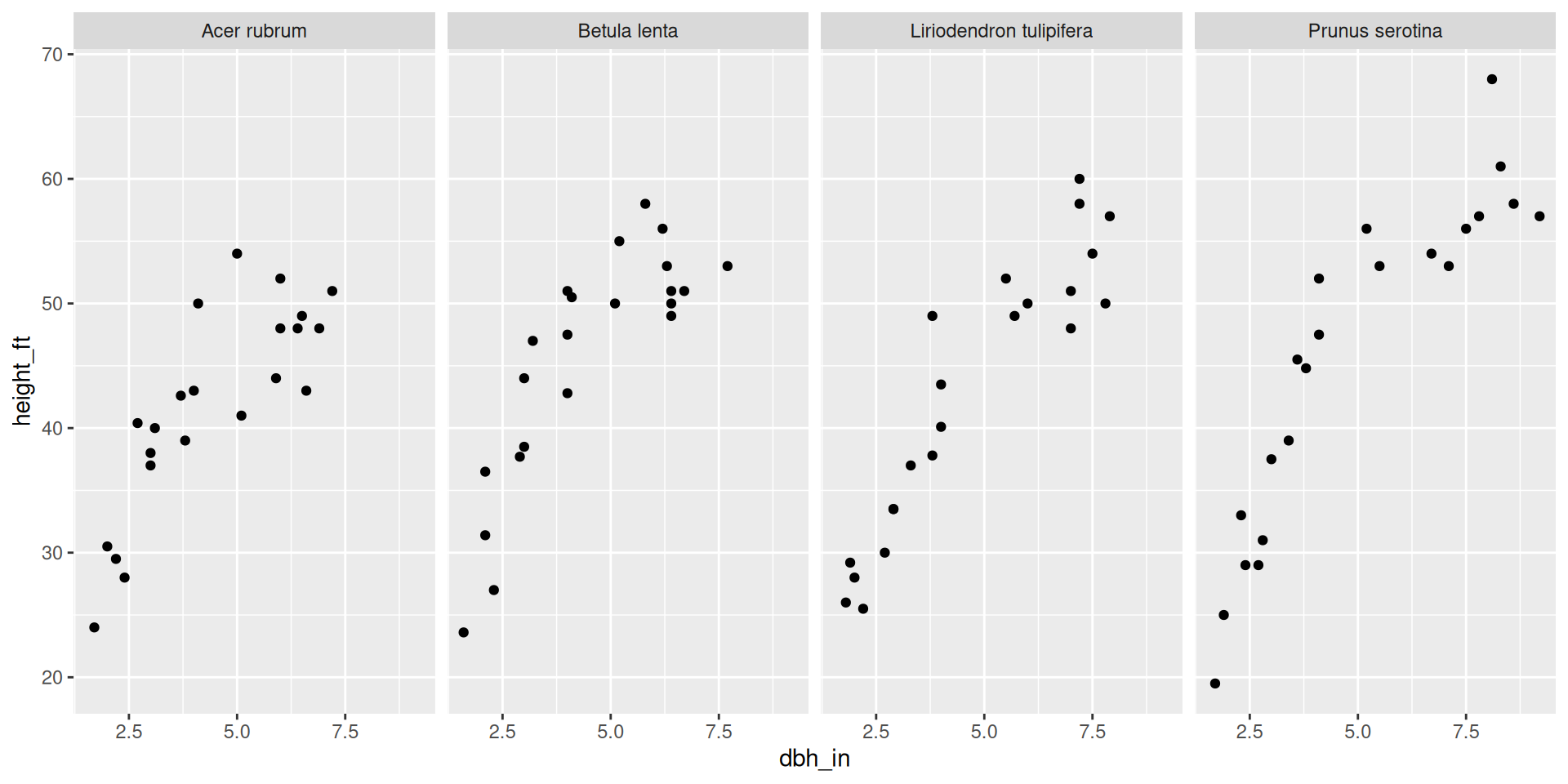
ggplot(data = fef, mapping = aes(x = dbh_in,
                                 y = height_ft)) +
  geom_point() +
  facet_wrap(~species, nrow = 1)

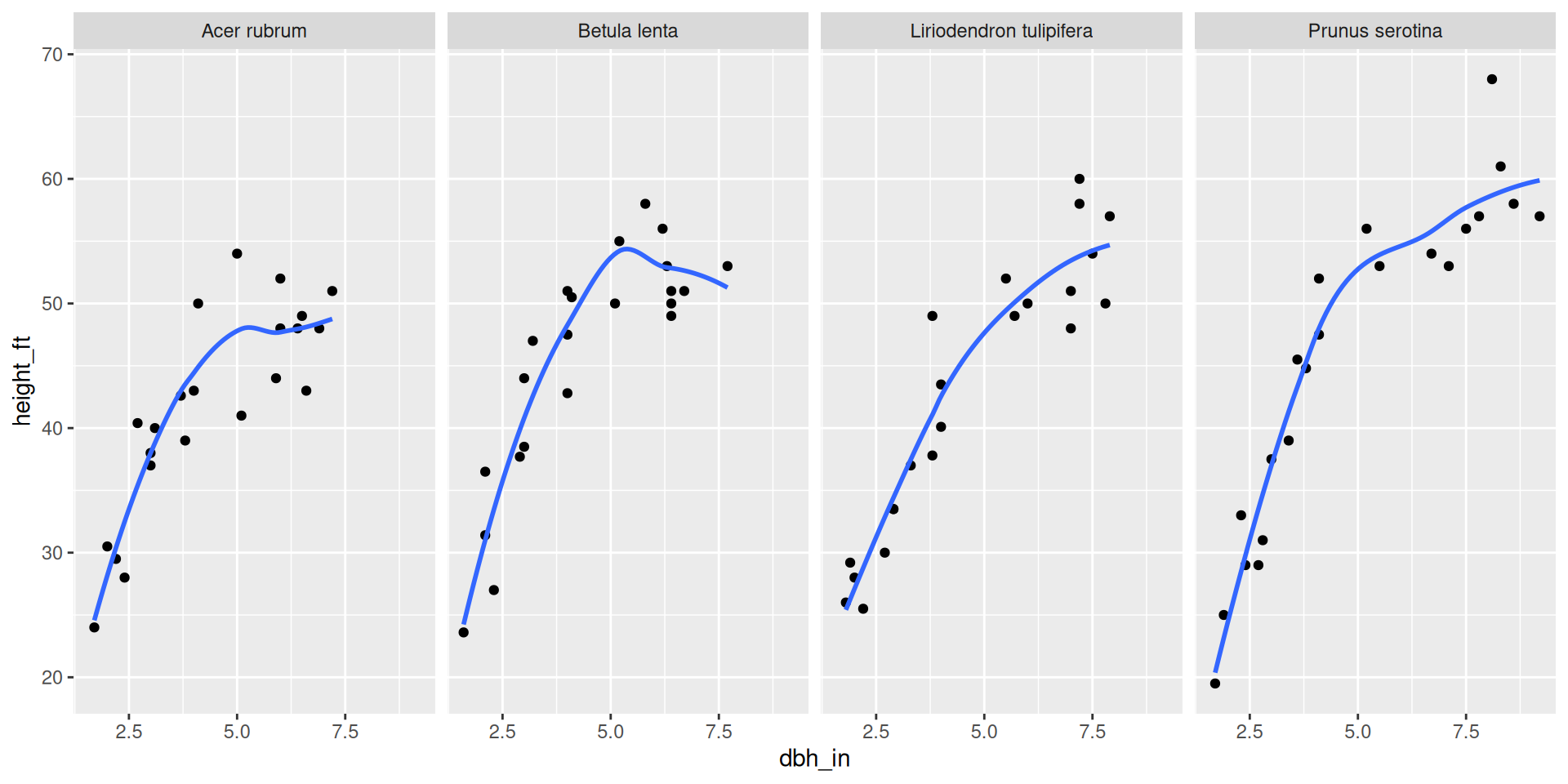
Adding a smoothing line

ggplot(data = fef, mapping = aes(x = dbh_in,
                                 y = height_ft)) +
  geom_point() +
  geom_smooth(se = FALSE) + 
  facet_wrap(~species, nrow = 1)

Color aesthetic mapping + facet by species.
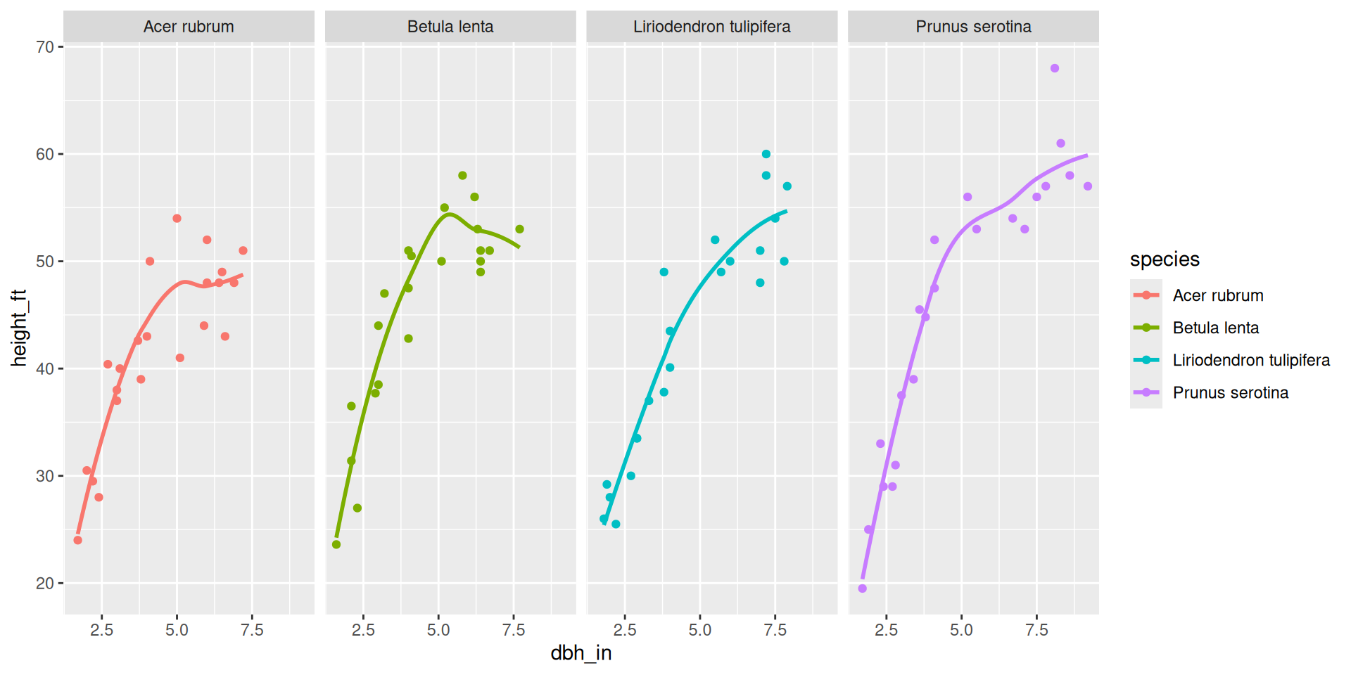
ggplot(data = fef, mapping = aes(x = dbh_in,
                                 y = height_ft,
                                 color = species)) +
  geom_point() +
  geom_smooth(se = FALSE) + 
  facet_wrap(~species, nrow = 1)

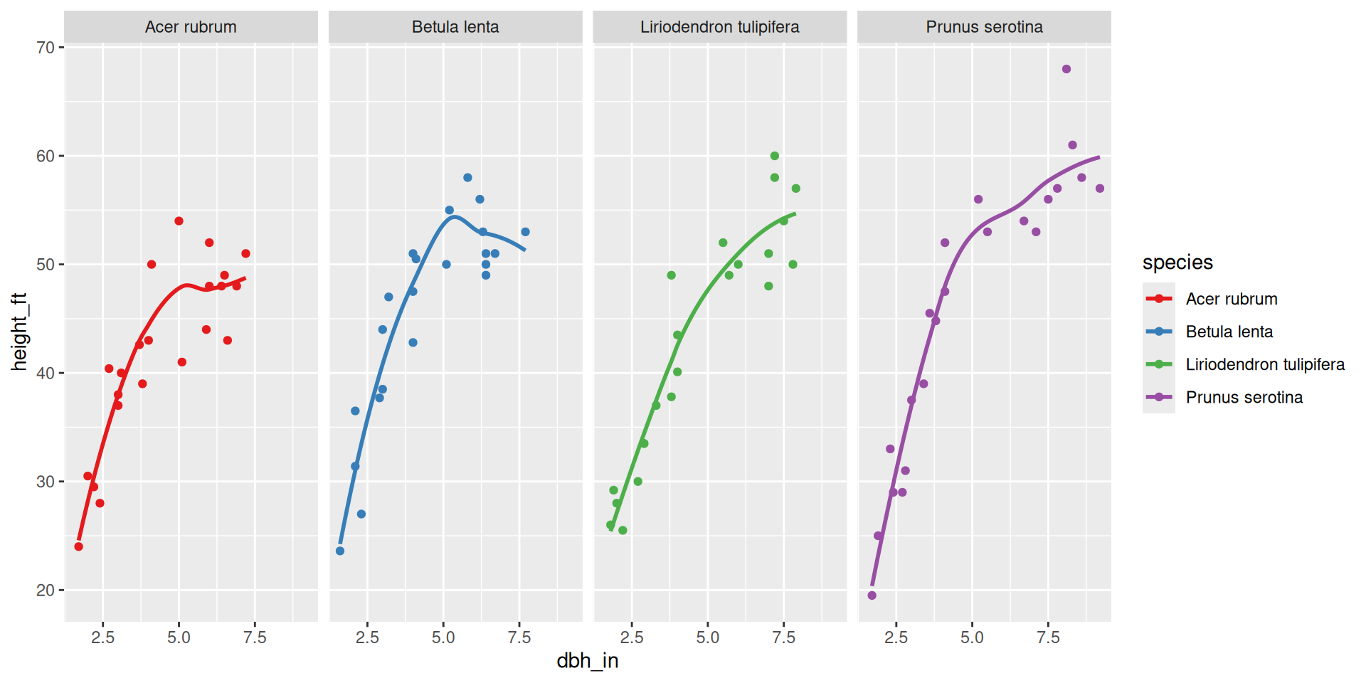
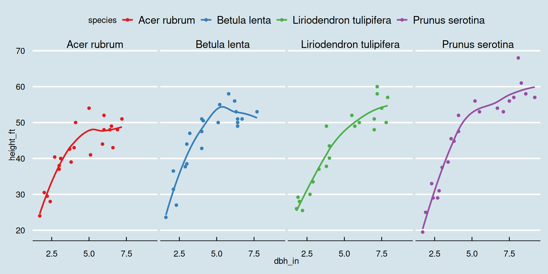
New color scale

ggplot(data = fef, mapping = aes(x = dbh_in,
                                 y = height_ft,
                                 color = species)) +
  geom_point() +
  geom_smooth(se = FALSE) + 
  facet_wrap(~species, nrow = 1) +
  scale_color_brewer(palette = "Set1")

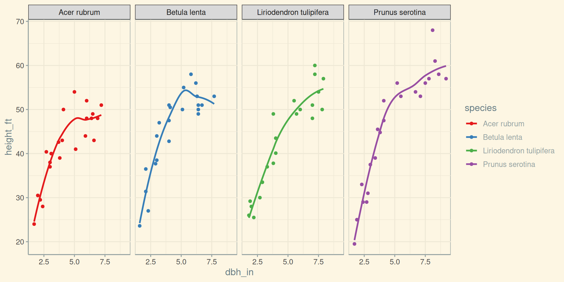
Specifying a theme

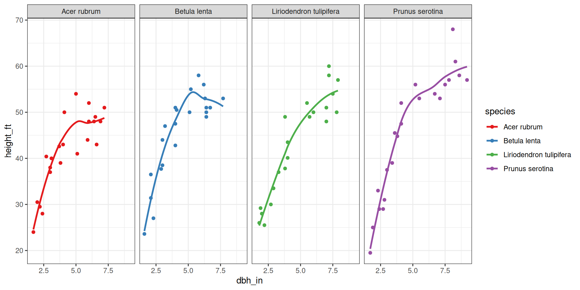
ggplot(data = fef, mapping = aes(x = dbh_in,
                                 y = height_ft,
                                 color = species)) +
  geom_point() +
  geom_smooth(se = FALSE) + 
  facet_wrap(~species, nrow = 1) +
  scale_color_brewer(palette = "Set1") +
  theme_bw()

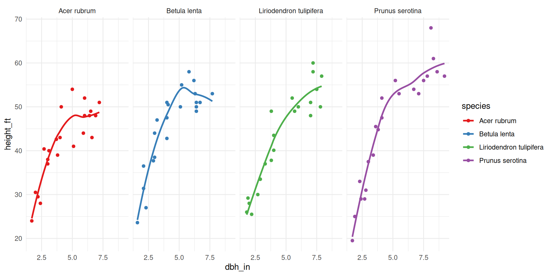
Specifying a theme

ggplot(data = fef, mapping = aes(x = dbh_in,
                                 y = height_ft,
                                 color = species)) +
  geom_point() +
  geom_smooth(se = FALSE) + 
  facet_wrap(~species, nrow = 1) +
  scale_color_brewer(palette = "Set1") +
  theme_minimal()

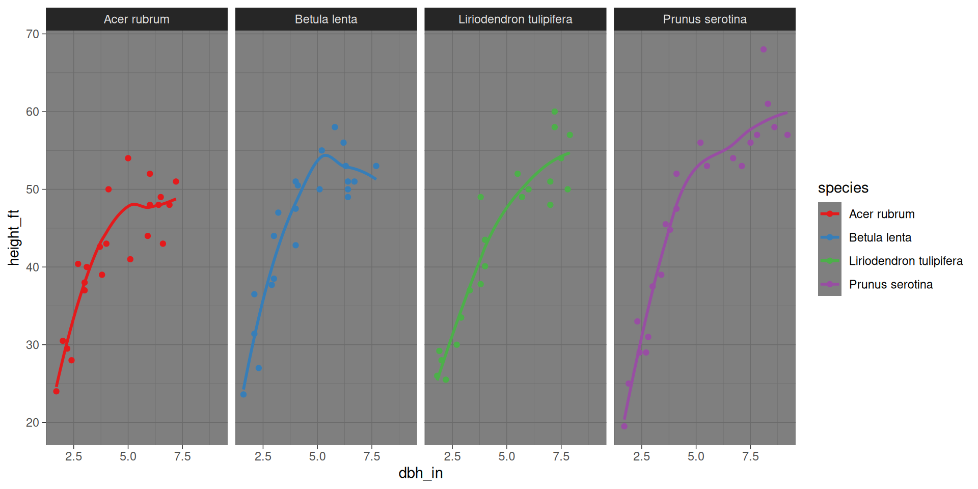
Specifying a theme

ggplot(data = fef, mapping = aes(x = dbh_in,
                                 y = height_ft,
                                 color = species)) +
  geom_point() +
  geom_smooth(se = FALSE) + 
  facet_wrap(~species, nrow = 1) +
  scale_color_brewer(palette = "Set1") +
  theme_dark()

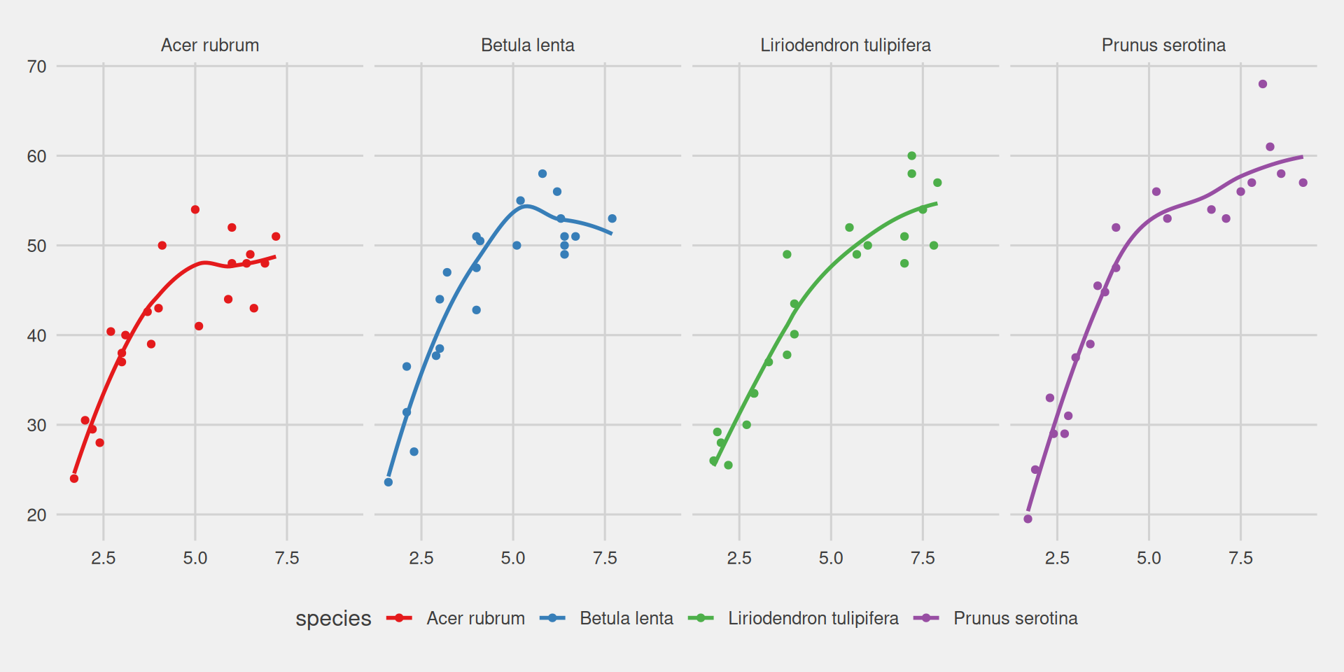
Specifying a theme

library(ggthemes)
ggplot(data = fef, mapping = aes(x = dbh_in,
                                 y = height_ft,
                                 color = species)) +
  geom_point() +
  geom_smooth(se = FALSE) + 
  facet_wrap(~species, nrow = 1) +
  scale_color_brewer(palette = "Set1") +
  theme_fivethirtyeight()

Specifying a theme

ggplot(data = fef, mapping = aes(x = dbh_in,
                                 y = height_ft,
                                 color = species)) +
  geom_point() +
  geom_smooth(se = FALSE) + 
  facet_wrap(~species, nrow = 1) +
  scale_color_brewer(palette = "Set1") +
  theme_economist()

Specifying a theme

ggplot(data = fef, mapping = aes(x = dbh_in,
                                 y = height_ft,
                                 color = species)) +
  geom_point() +
  geom_smooth(se = FALSE) + 
  facet_wrap(~species, nrow = 1) +
  scale_color_brewer(palette = "Set1") +
  theme_solarized()

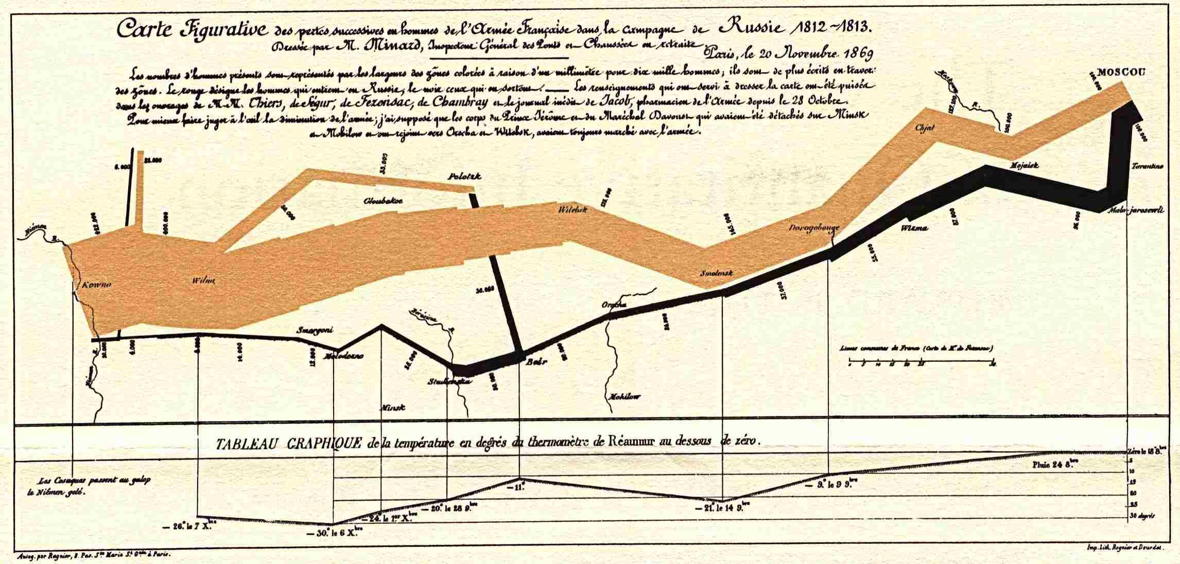
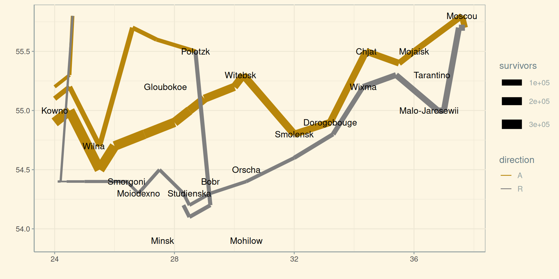
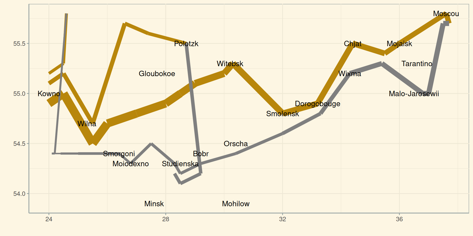
Napoleon’s march on Moscow

Napoleon’s march on Moscow: in R

cities <- read_table("minard-cities.txt")
troops <- read_table("minard-troops.txt")

Napoleon’s march on Moscow: in R

cities
# A tibble: 20 × 3
    long   lat city          
   <dbl> <dbl> <chr>         
 1  24    55   Kowno         
 2  25.3  54.7 Wilna         
 3  26.4  54.4 Smorgoni      
 4  26.8  54.3 Moiodexno     
 5  27.7  55.2 Gloubokoe     
 6  27.6  53.9 Minsk         
 7  28.5  54.3 Studienska    
 8  28.7  55.5 Polotzk       
 9  29.2  54.4 Bobr          
10  30.2  55.3 Witebsk       
11  30.4  54.5 Orscha        
12  30.4  53.9 Mohilow       
13  32    54.8 Smolensk      
14  33.2  54.9 Dorogobouge   
15  34.3  55.2 Wixma         
16  34.4  55.5 Chjat         
17  36    55.5 Mojaisk       
18  37.6  55.8 Moscou        
19  36.6  55.3 Tarantino     
20  36.5  55   Malo-Jarosewii

Napoleon’s march on Moscow: in R

troops
# A tibble: 51 × 5
    long   lat survivors direction group
   <dbl> <dbl>     <dbl> <chr>     <dbl>
 1  24    54.9    340000 A             1
 2  24.5  55      340000 A             1
 3  25.5  54.5    340000 A             1
 4  26    54.7    320000 A             1
 5  27    54.8    300000 A             1
 6  28    54.9    280000 A             1
 7  28.5  55      240000 A             1
 8  29    55.1    210000 A             1
 9  30    55.2    180000 A             1
10  30.3  55.3    175000 A             1
# ℹ 41 more rows

Napoleon’s march on Moscow: in R

ggplot(data = troops, mapping = aes(long, lat)) 

Napoleon’s march on Moscow: in R

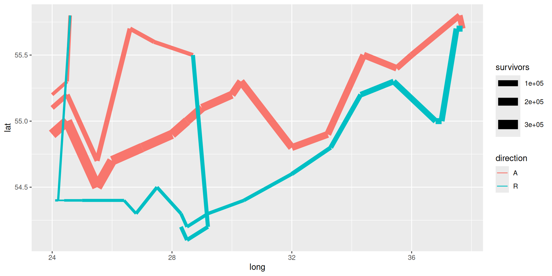
ggplot(mapping = aes(long, lat)) +
  geom_path(data = troops, aes(size = survivors, color = direction, group = group))

Napoleon’s march on Moscow: in R

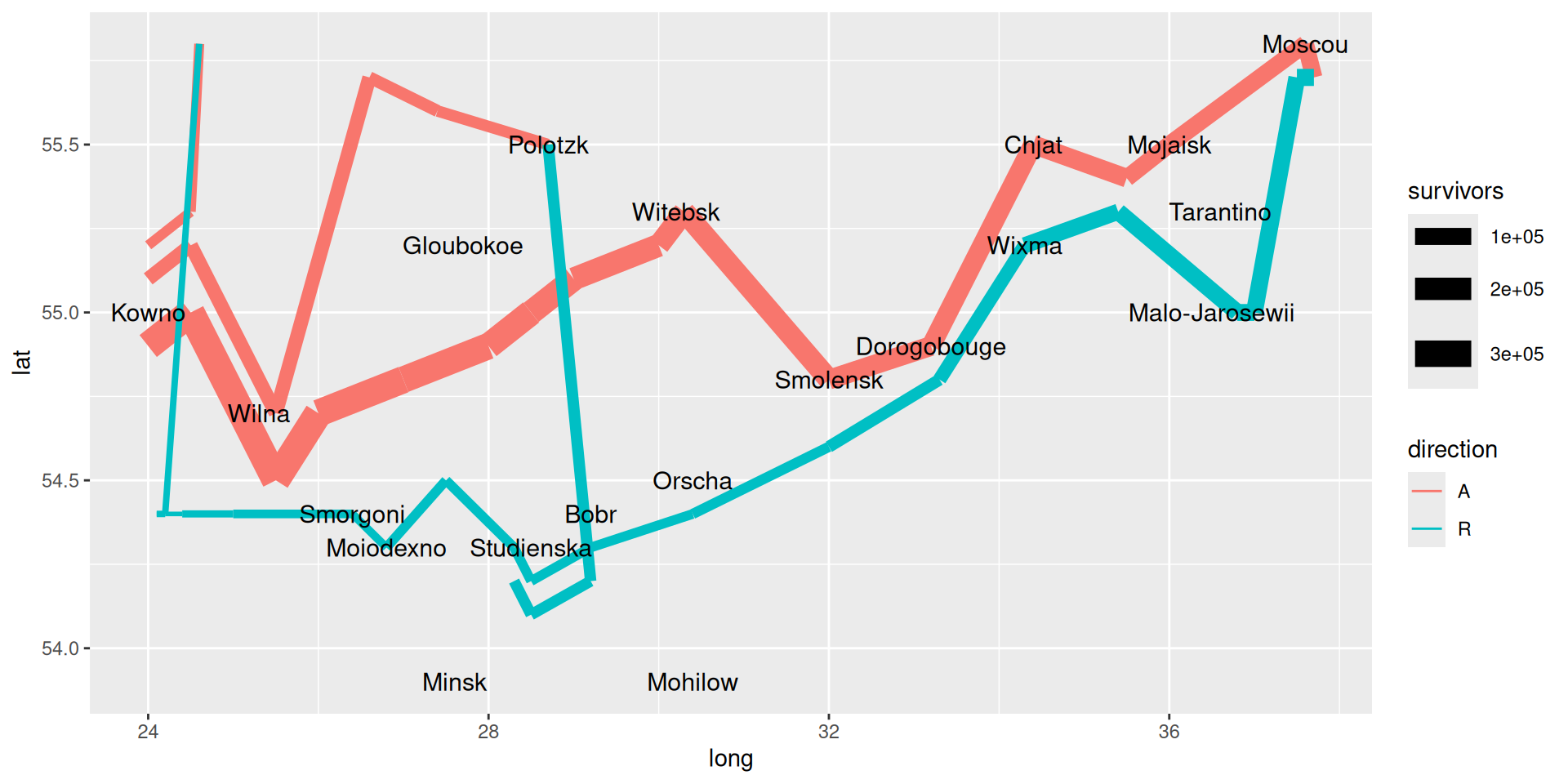
ggplot(mapping = aes(long, lat)) +
  geom_path(data = troops, aes(size = survivors, color = direction, group = group)) + 
  geom_text(data = cities, mapping = aes(label = city), size = 4)

Napoleon’s march on Moscow: in R

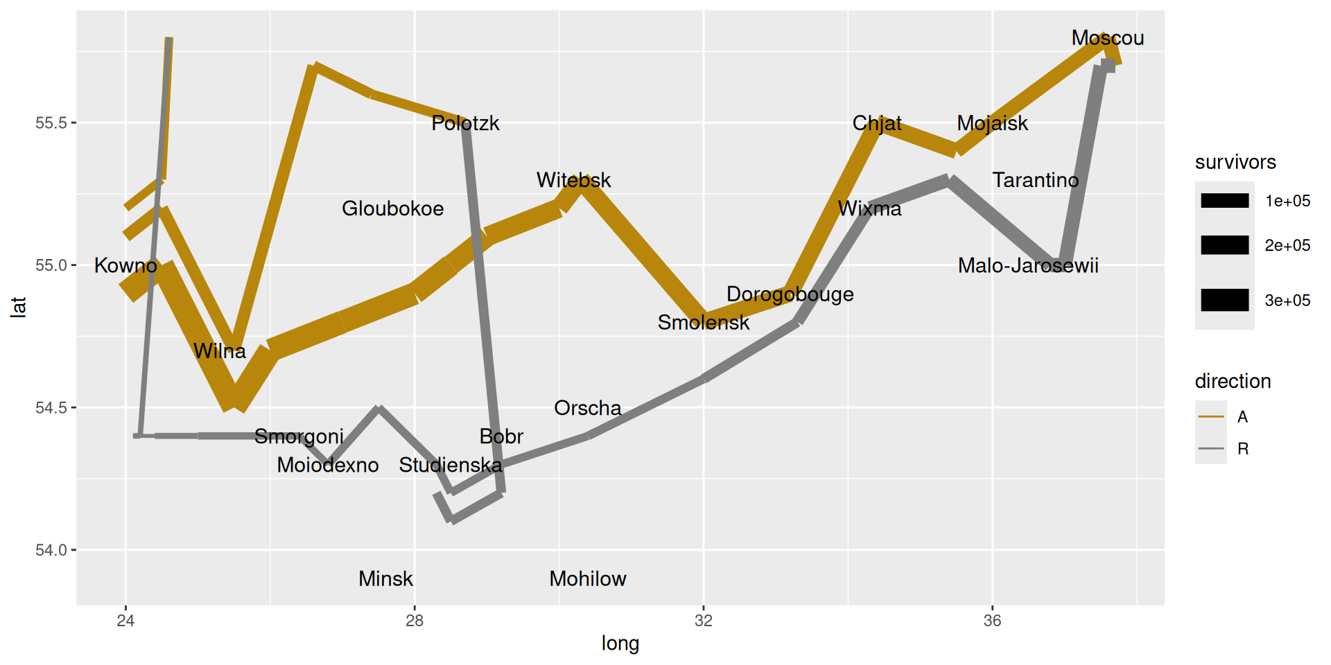
ggplot(mapping = aes(long, lat)) +
  geom_path(data = troops, aes(size = survivors, color = direction, group = group)) + 
  geom_text(data = cities, mapping = aes(label = city), size = 4) + 
  scale_color_manual(values = c("darkgoldenrod","grey50"))

Napoleon’s march on Moscow: in R

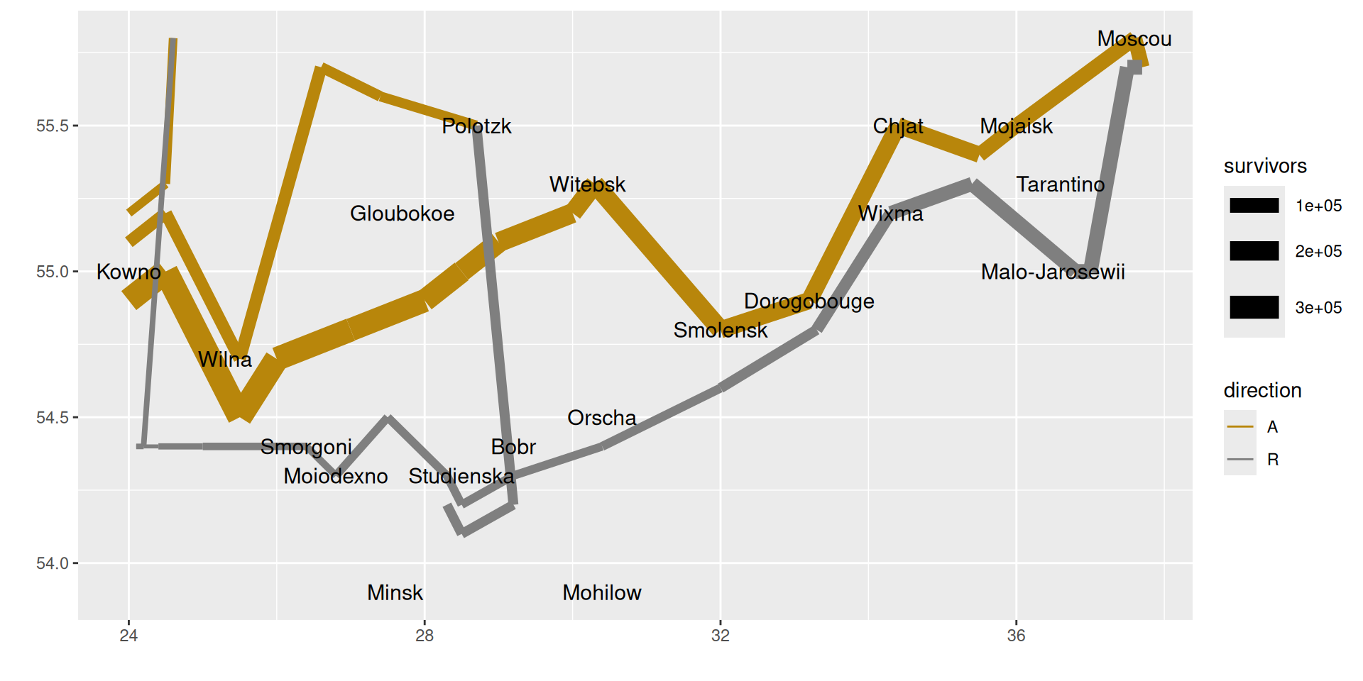
ggplot(mapping = aes(long, lat)) +
  geom_path(data = troops, aes(size = survivors, color = direction, group = group)) + 
  geom_text(data = cities, mapping = aes(label = city), size = 4) + 
  scale_color_manual(values = c("darkgoldenrod","grey50")) +
  labs(x = "", y = "")

Napoleon’s march on Moscow: in R

ggplot(mapping = aes(long, lat)) +
  geom_path(data = troops, aes(size = survivors, color = direction, group = group)) + 
  geom_text(data = cities, mapping = aes(label = city), size = 4) + 
  scale_color_manual(values = c("darkgoldenrod","grey50")) +
  labs(x = "", y = "") + 
  theme_solarized()

Napoleon’s march on Moscow: in R

ggplot(mapping = aes(long, lat)) +
  geom_path(data = troops, aes(size = survivors, color = direction, group = group)) + 
  geom_text(data = cities, mapping = aes(label = city), size = 4) + 
  scale_color_manual(values = c("darkgoldenrod","grey50")) +
  labs(x = "", y = "") + 
  theme_solarized() +
  theme(legend.position = "none")
Questions to consider

  • How should we depict the species in these graphics? What is best? (hint: it depends)
  • What separates a good graphic from a bad one? From a great one?

Next time

  • More plotting with ggplot2!
    • histograms and bar plots
    • careful considerations when making plots