# A tibble: 88 × 18
   watershed  year  plot species     dbh_in height_ft stem_green_kg top_green_kg
       <dbl> <dbl> <dbl> <chr>        <dbl>     <dbl>         <dbl>        <dbl>
 1         3  1991    29 Acer rubrum    6        48            92.2         13.1
 2         3  1991    33 Acer rubrum    6.9      48           102.          23.1
 3         3  1991    35 Acer rubrum    6.4      48           124.           8.7
 4         3  1991    39 Acer rubrum    6.5      49            91.7         39
 5         3  1991    44 Acer rubrum    7.2      51           186.           8.9
 6         3  1992    26 Acer rubrum    3.1      40            20.8          0.9
 7         3  1992    26 Acer rubrum    2        30.5           5.6          0.9
 8         3  1992    26 Acer rubrum    4.1      50            54.1          8.6
 9         3  1992    48 Acer rubrum    2.4      28            10.2          0.7
10         3  1992    48 Acer rubrum    2.7      40.4          20.2          5
# ℹ 78 more rows
# ℹ 10 more variables: smbranch_green_kg <dbl>, lgbranch_green_kg <dbl>,
#   allwoody_green_kg <dbl>, leaves_green_kg <dbl>, stem_dry_kg <dbl>,
#   top_dry_kg <dbl>, smbranch_dry_kg <dbl>, lgbranch_dry_kg <dbl>,
# allwoody_dry_kg <dbl>, leaves_dry_kg <dbl>More graphics with ggplot2
Annoucements
- UPDATE: Midterm II is moved to Thursday, November 21st, during lab time.
- Material on the midterm will include all material through Week 12.
- The midterm will be of similar form to the last midterm.
- Closed materials, but you are allowed one 8.5” x 11” sheet of paper, double-sided, hand-written note sheet.
Agenda
- Final project
- Review components of a graphic (i.e. the grammar of graphics)
- Composing a graphic: bar plots, histograms, titles, labels, aesthetics vs. set values
Final project
Components of a graphic (review)
What is a graphic made up of?
- Data, and
- Visual components
Visual components
In order to create a graphic or “plot”, one must choose visualize the variables of the data to the attributes of the plot. Further, one must choose the cosmetic properties of the plot.
Layers can be specified as a variety of components:
- geom: the geometric shape that the data are mapped to,
- Examples: point, line, bar, text, path, …
- aesthetics: The visual properties of the geom.
- Examples: x-position, y-position, color, fill, shape
- coord: coordinate system,
- Examples: Cartesian, polar, lon/lat projection
- scale: how data are mapped to certain aesthetics.
- Example: which colors or shapes to use?
- Example: which colors or shapes to use?
- facet: a technique to split plots into multiple panels,
- themes: the cosmetic attributes of the plot.
Composing a graphic
Again, consider the fef dataset
Geometry: bar
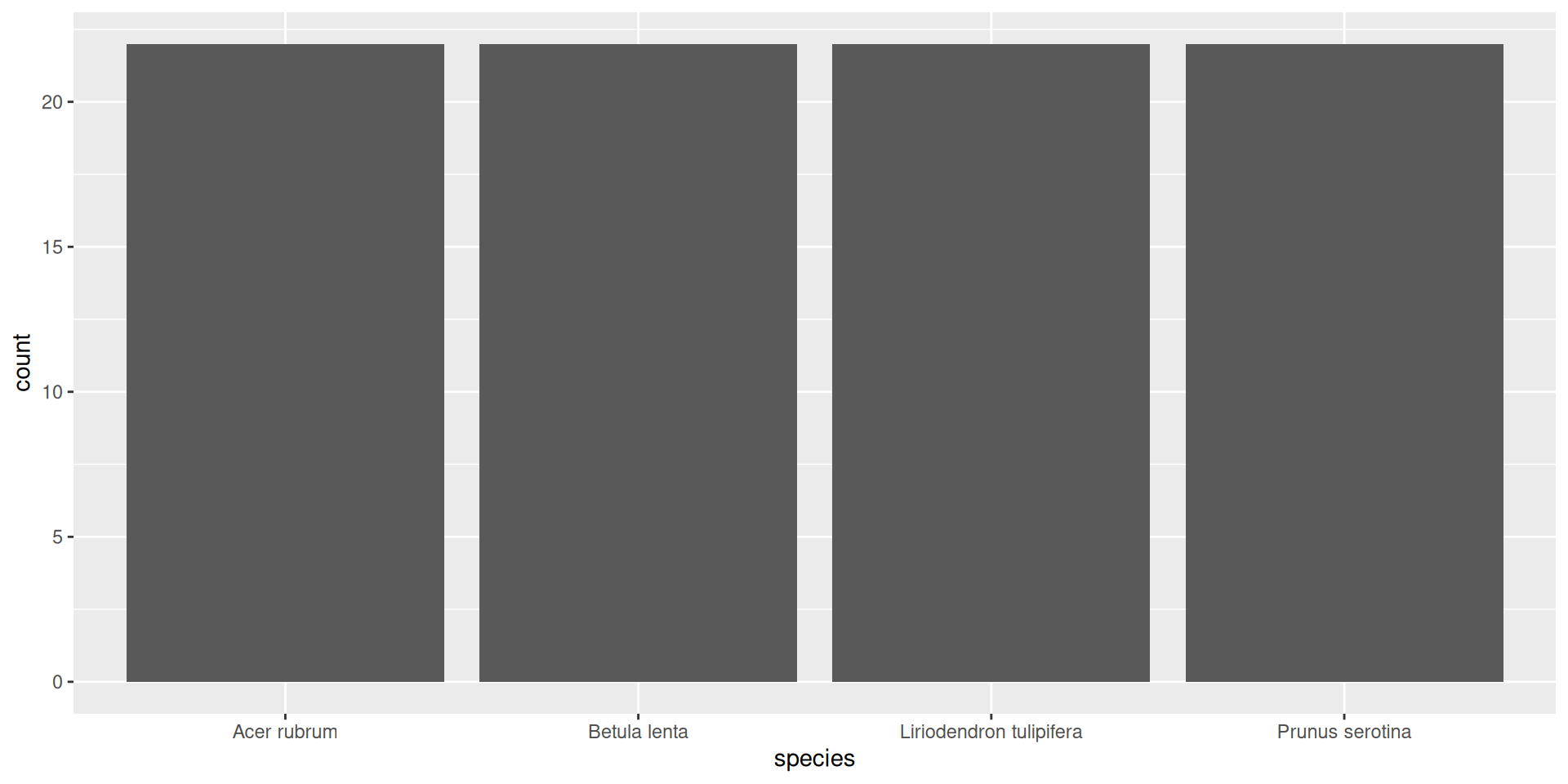
Geometry: bar

Geometry: histogram
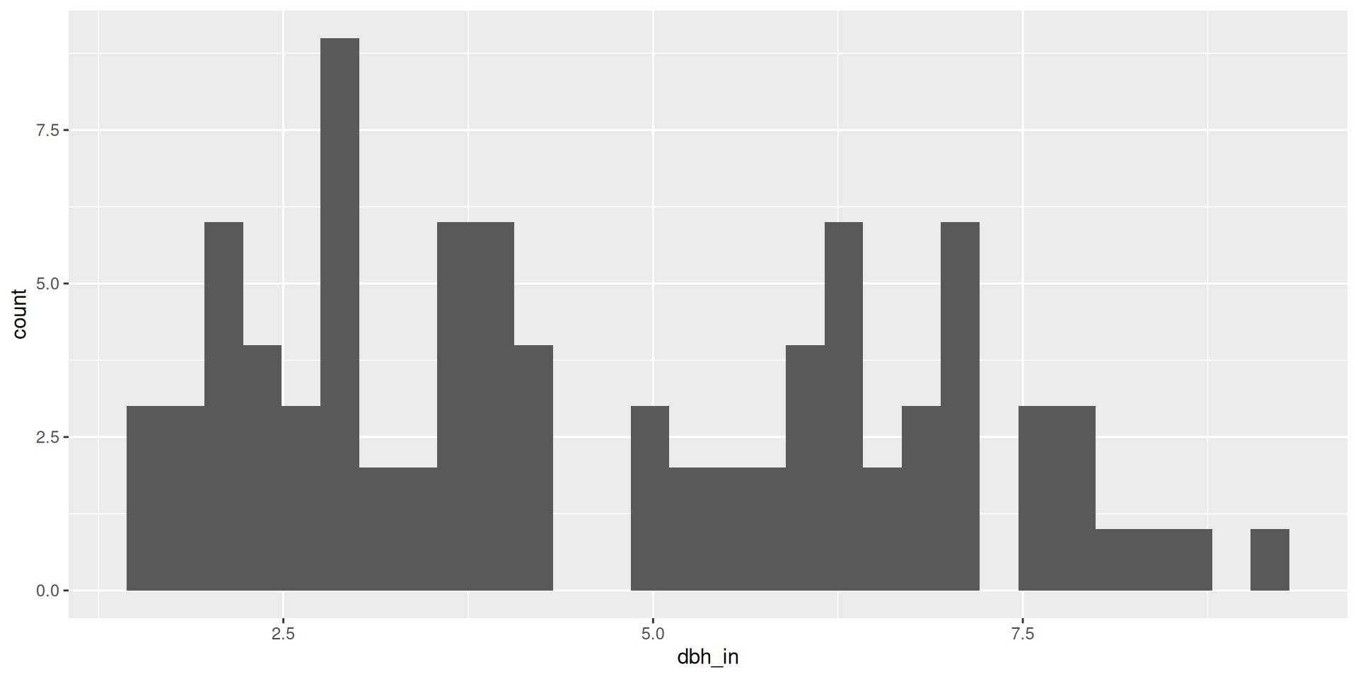
Geometry: histogram
Let’s create a plot
First, our canvas:
Let’s create a plot

Let’s create a plot
Then, we specify the data:
Let’s create a plot

Let’s create a plot
Then we specify some aesthetic mappings
Let’s create a plot
Let’s create a plot
We’ve now specified that we will map these aesthetics to “points”.
Let’s create a plot
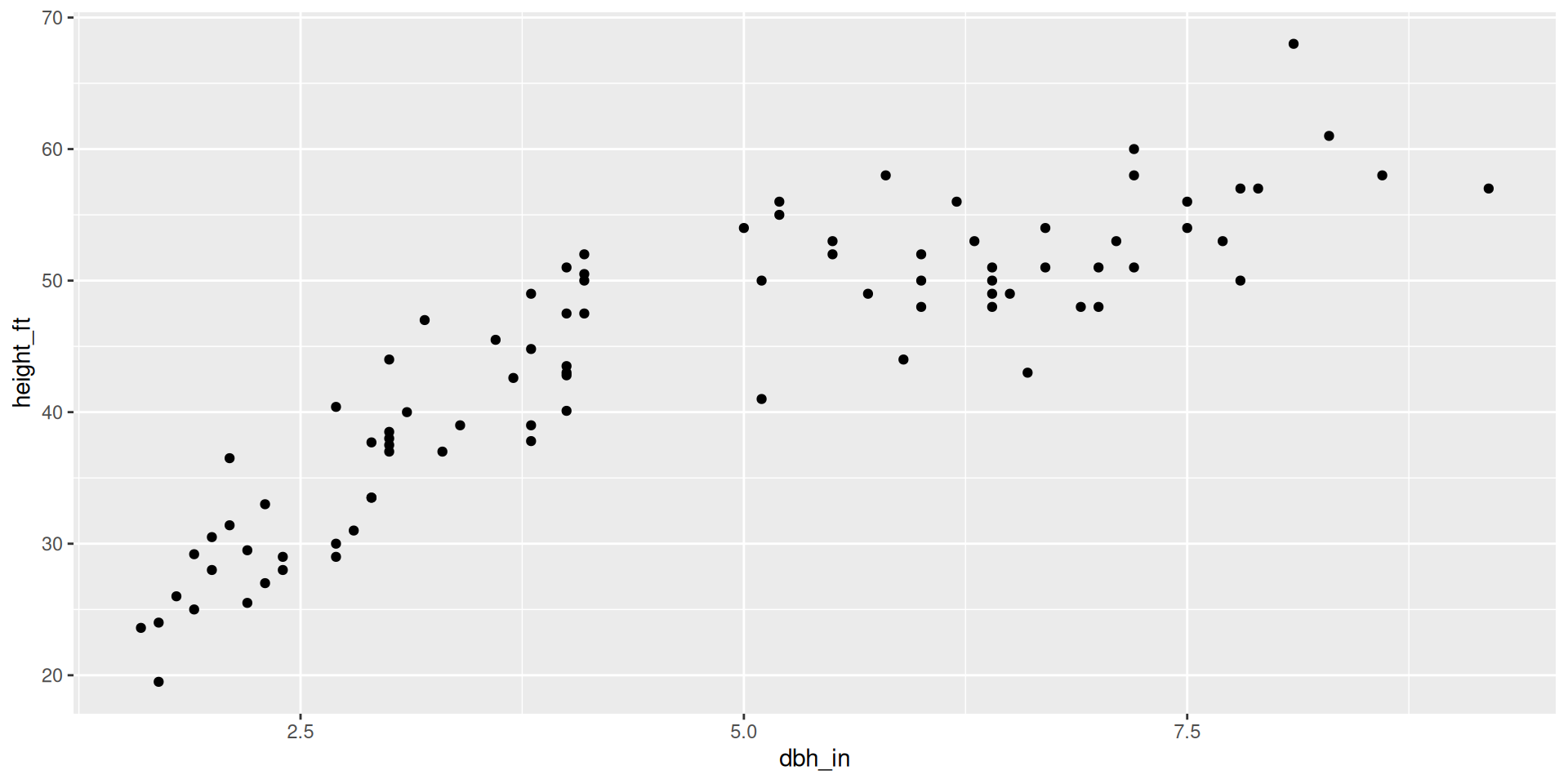
Let’s create a plot
You can also specify the aesthetic mapping in the geometry layer:
Let’s create a plot

Let’s create a plot
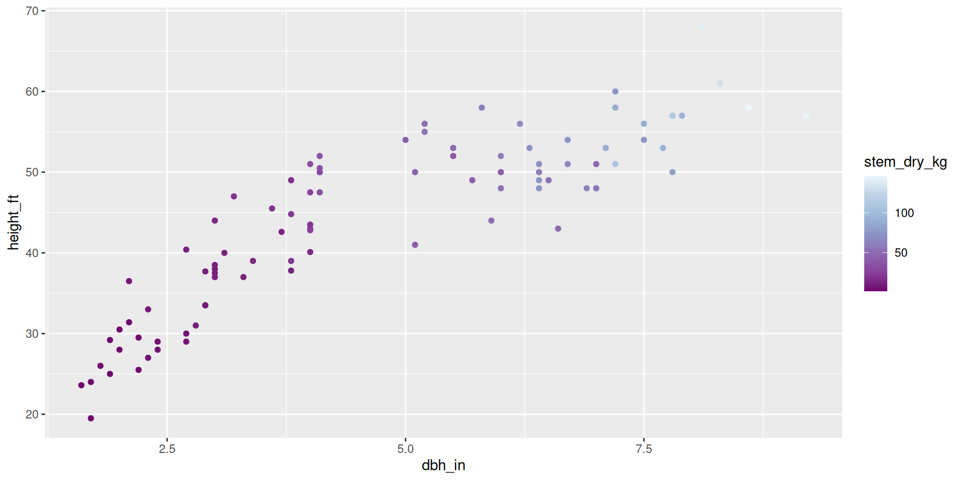
We can look at a third variable by adding another aesthetic mapping:
Let’s create a plot
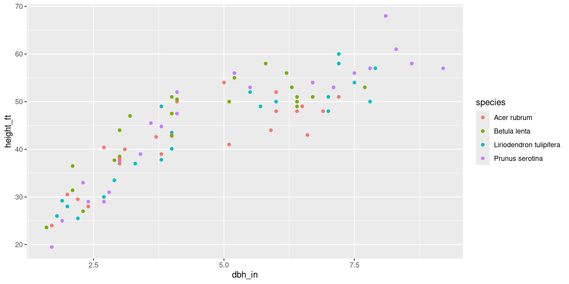
Let’s create a plot
Color scales are different for continuous vs discrete data:
Let’s create a plot
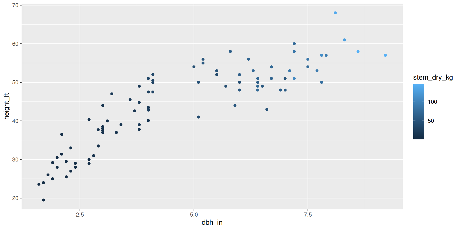
Let’s create a plot
Rather than mapping stem_dry_kg to color, we could map it to size:
Let’s create a plot
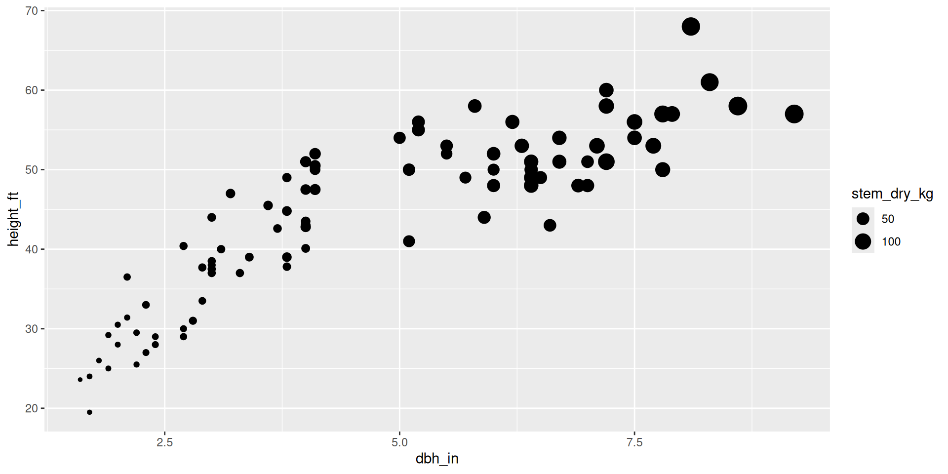
Let’s create a plot
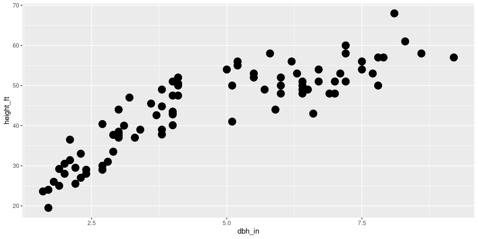
This is different than setting size outside of the aesthetics:
Let’s create a plot
Let’s create a plot
Let’s make this plot beautiful:
Let’s create a plot

Let’s create a plot
Let’s make this plot beautiful:
Let’s create a plot

Let’s create a plot
Let’s make this plot beautiful:
Let’s create a plot
Let’s create a plot
Let’s make this plot beautiful:
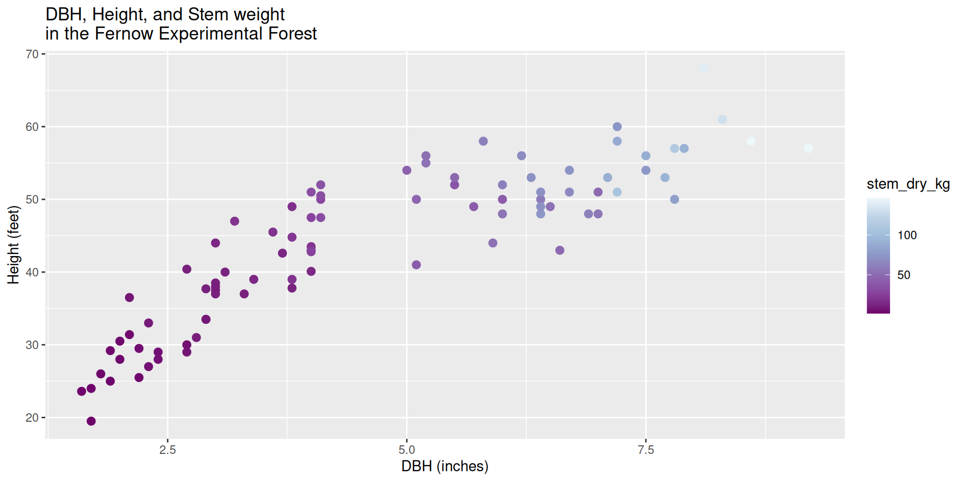
ggplot(data = fef) +
  geom_point(mapping = aes(x = dbh_in,
                           y = height_ft,
                           color = stem_dry_kg),
             size = 2.5) +
  scale_colour_distiller(type = "seq", palette = 3) +
  labs(x = "DBH (inches)",
       y = "Height (feet)",
       fill = "Dry Stem \nWeight (kg)",
       title = "DBH, Height, and Stem weight \nin the Fernow Experimental Forest")
Let’s create a plot
Let’s create a plot
Let’s make this plot beautiful:
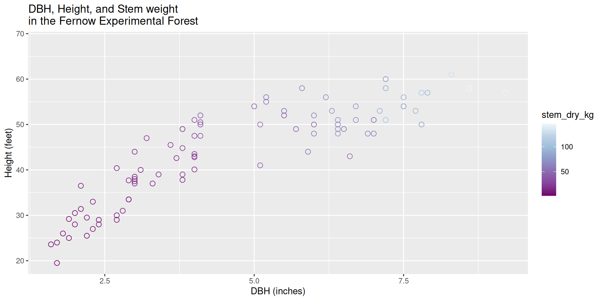
ggplot(data = fef) +
  geom_point(mapping = aes(x = dbh_in,
                           y = height_ft,
                           color = stem_dry_kg),
             size = 2.5,
             shape = 21) +
  scale_colour_distiller(type = "seq", palette = 3) +
  labs(x = "DBH (inches)",
       y = "Height (feet)",
       fill = "Dry Stem \nWeight (kg)",
       title = "DBH, Height, and Stem weight \nin the Fernow Experimental Forest")
Let’s create a plot
Let’s create a plot
Let’s make this plot beautiful:
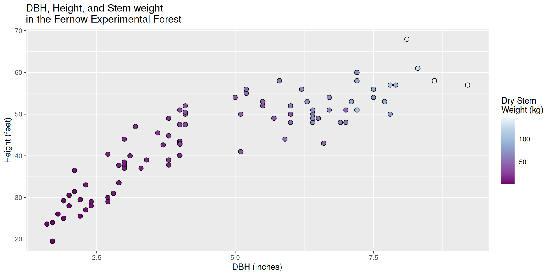
ggplot(data = fef) +
  geom_point(mapping = aes(x = dbh_in,
                           y = height_ft,
                           fill = stem_dry_kg),
             size = 2.5,
             shape = 21) +
  scale_fill_distiller(type = "seq", palette = 3) +
  labs(x = "DBH (inches)",
       y = "Height (feet)",
       fill = "Dry Stem \nWeight (kg)",
       title = "DBH, Height, and Stem weight \nin the Fernow Experimental Forest")
Let’s create a plot
Let’s create a plot
Let’s make this plot beautiful:
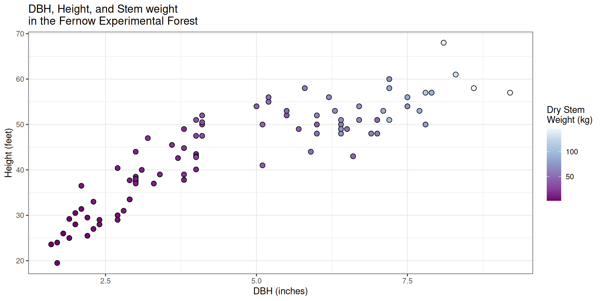
ggplot(data = fef) +
  geom_point(mapping = aes(x = dbh_in,
                           y = height_ft,
                           fill = stem_dry_kg),
             size = 2.5,
             shape = 21) +
  scale_fill_distiller(type = "seq", palette = 3) +
  labs(x = "DBH (inches)",
       y = "Height (feet)",
       fill = "Dry Stem \nWeight (kg)",
       title = "DBH, Height, and Stem weight \nin the Fernow Experimental Forest") +
  theme_bw()
Let’s create a plot
Let’s create a plot
Let’s make this plot beautiful:
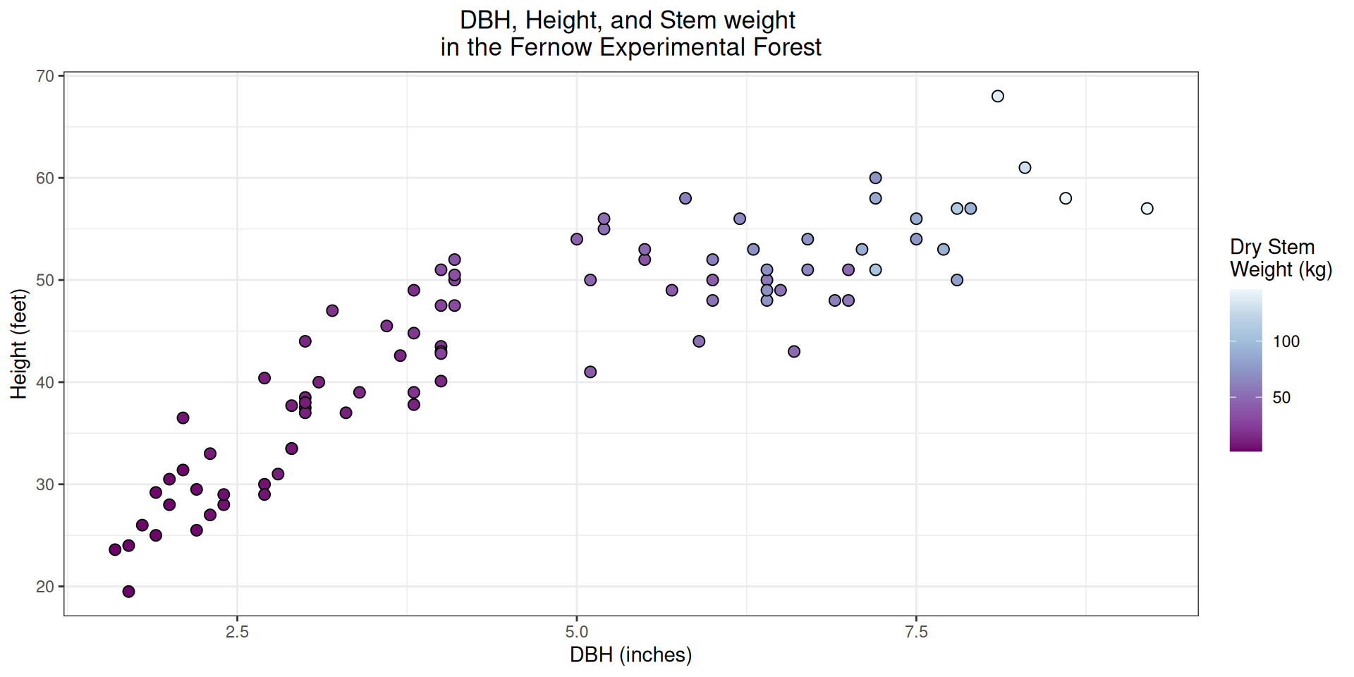
ggplot(data = fef) +
  geom_point(mapping = aes(x = dbh_in,
                           y = height_ft,
                           fill = stem_dry_kg),
             size = 2.5,
             shape = 21) +
  scale_fill_distiller(type = "seq", palette = 3) +
  labs(x = "DBH (inches)",
       y = "Height (feet)",
       fill = "Dry Stem \nWeight (kg)",
       title = "DBH, Height, and Stem weight \nin the Fernow Experimental Forest") +
  theme_bw() +
  theme(plot.title = element_text(hjust = 0.5))
Let’s create a plot
Next time
- More plotting with
ggplot2!- more details on histograms and bar plots
- careful considerations when making plots
- spatial plotting