# A tibble: 74 × 34
   Longitude Latitude UserID Genus    Family     DBH Inventory_Date      Species
       <dbl>    <dbl> <chr>  <chr>    <chr>    <dbl> <dttm>              <chr>
 1     -123.     45.5 19041  Acer     Sapinda…   8.4 2019-07-27 00:00:00 ACPL
 2     -123.     45.5 19043  Acer     Sapinda…   6.2 2019-07-27 00:00:00 ACPL
 3     -123.     45.5 19045  Acer     Sapinda…   8.3 2019-07-27 00:00:00 ACPL
 4     -123.     45.5 19050  Betula   Betulac…   4   2019-07-27 00:00:00 BENI
 5     -123.     45.5 19051  Carpinus Betulac…   7   2019-07-27 00:00:00 CABE
 6     -123.     45.5 19052  Carpinus Betulac…   6.8 2019-07-27 00:00:00 CABE
 7     -123.     45.5 19053  Carpinus Betulac…   5.9 2019-07-27 00:00:00 CABE
 8     -123.     45.5 19054  Carpinus Betulac…   7.2 2019-07-27 00:00:00 CABE
 9     -123.     45.5 19251  Carpinus Betulac…   7.4 2019-07-27 00:00:00 CABE
10     -123.     45.5 19253  Betula   Betulac…   2.7 2019-07-27 00:00:00 BENI
# ℹ 64 more rows
# ℹ 26 more variables: Common_Name <chr>, Condition <chr>, Tree_Height <dbl>,
#   Crown_Width_NS <dbl>, Crown_Width_EW <dbl>, Crown_Base_Height <dbl>,
#   Collected_By <chr>, Park <chr>, Scientific_Name <chr>,
#   Functional_Type <chr>, Mature_Size <fct>, Native <chr>, Edible <chr>,
#   Nuisance <chr>, Structural_Value <dbl>, Carbon_Storage_lb <dbl>,
# Carbon_Storage_value <dbl>, Carbon_Sequestration_lb <dbl>, …More graphics with ggplot2
Annoucements
Recall the following:
- UPDATE: Midterm II is moved to Thursday, November 21st, during lab time.
- Material on the midterm will include all material through Week 12 (this week!).
- The midterm will be of similar form to the last midterm.
- Closed materials, but you are allowed one 8.5” x 11” sheet of paper, double-sided, hand-written note sheet.
Agenda
- Review final project
- Histogram vs. bar plot
- Reordering quantities in
ggplot2output - Further details on scales
- Guides
Final project
Plotting with ggplot2
Data
Today, we’ll use some data from pdxTrees:
What are these plots called?

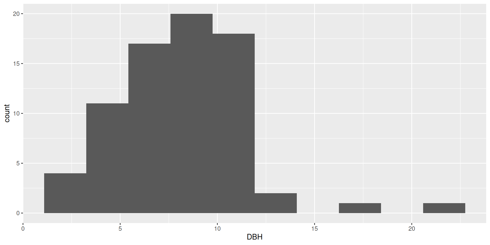
- Histogram!
- Uses continuous data
geom_histogram()

- Bar plot!
- Uses categorical data
geom_bar()
Bar plots
Bar plots
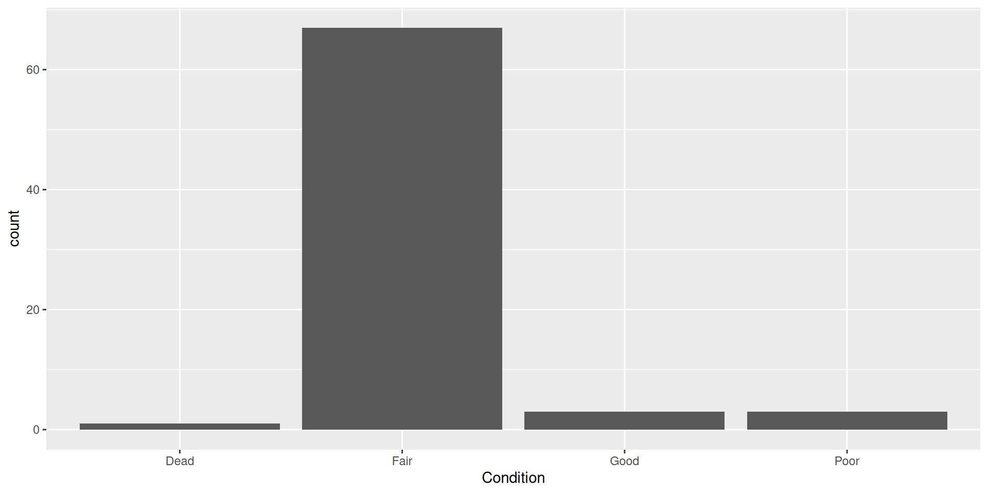
How can we represent more variables in a bar plot?
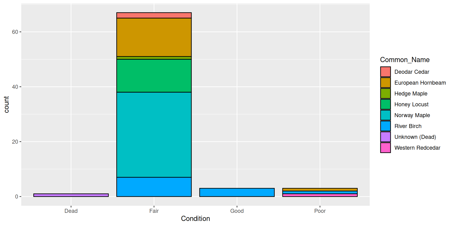
Adding a fill aesthetic mapping

Why doesn’t this work for DBH?

Adding a fill aesthetic mapping: what about color?
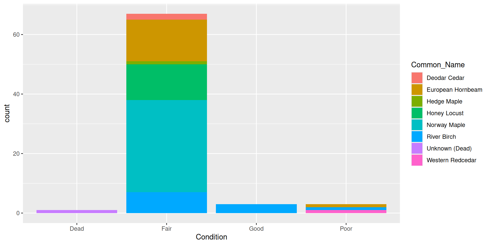
Adding a fill aesthetic mapping: what about color?
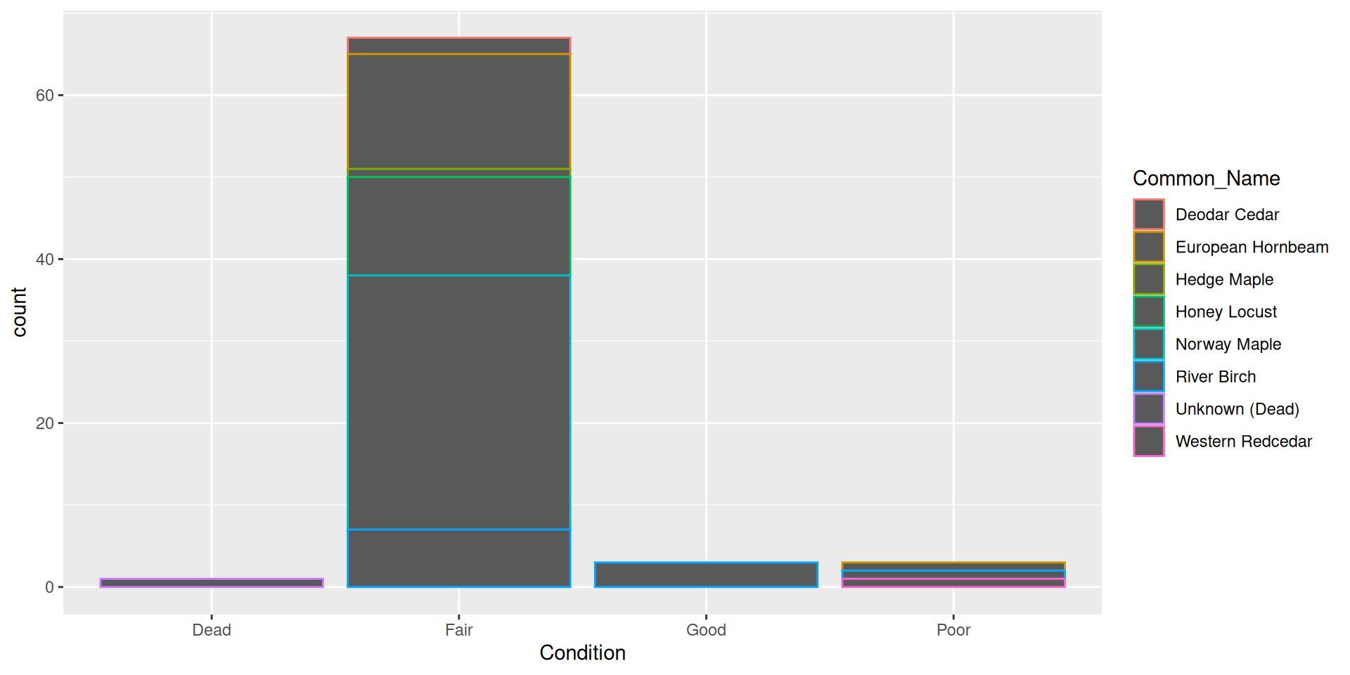
- Hard to read!
Aesthetic vs. set value
Aesthetic vs. set value
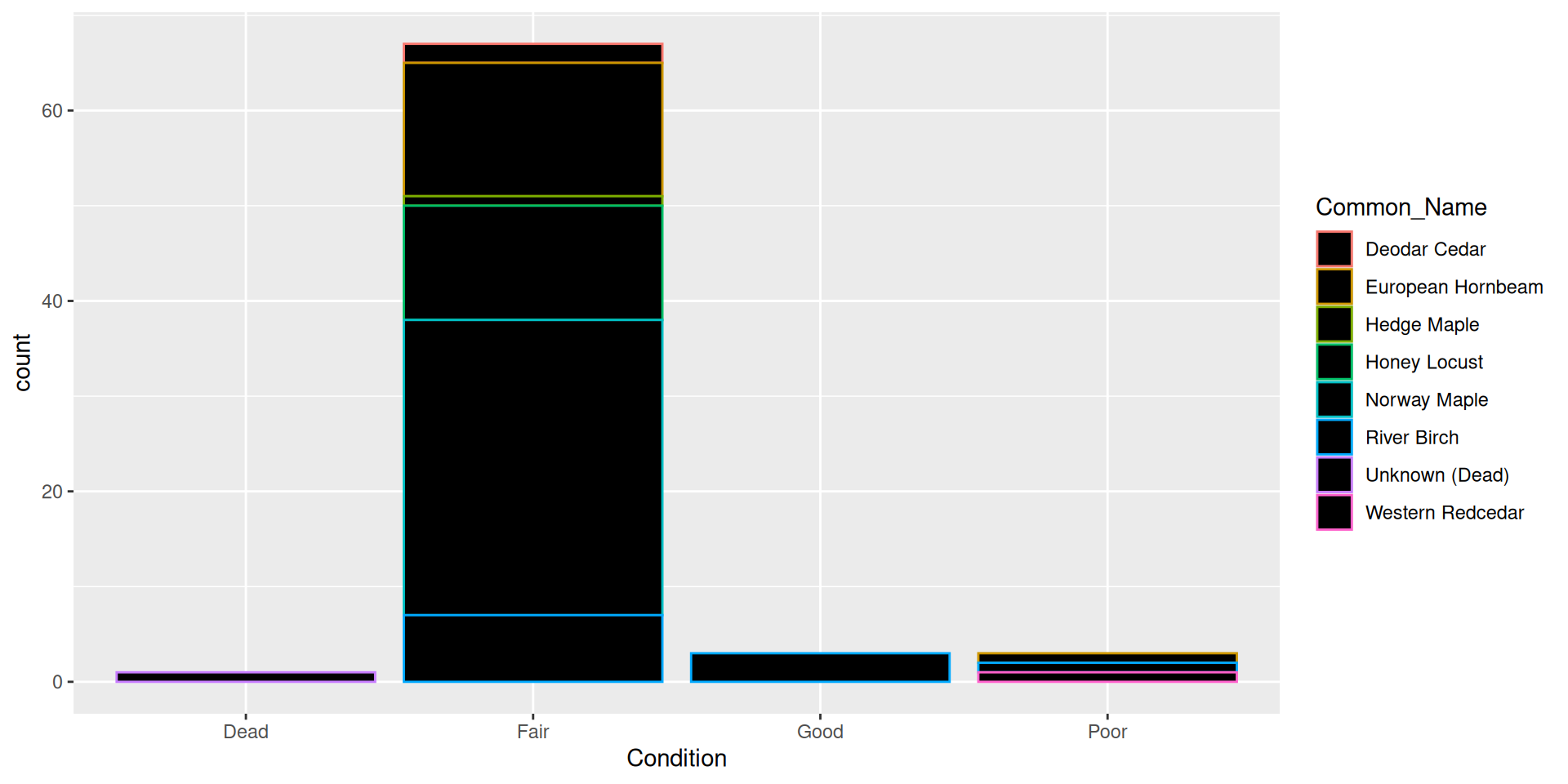
- Hard to read!
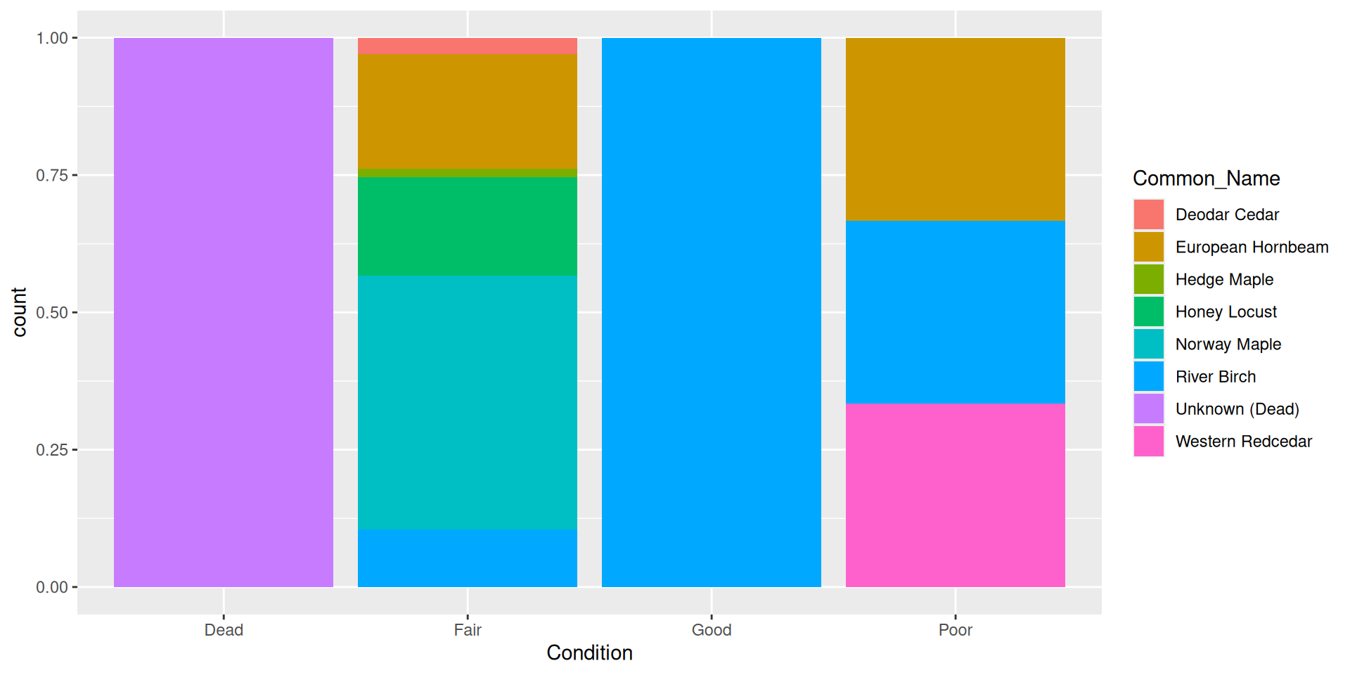
Back to a nice barplot
By default, bars are “stacked” (i.e. position = "stack")

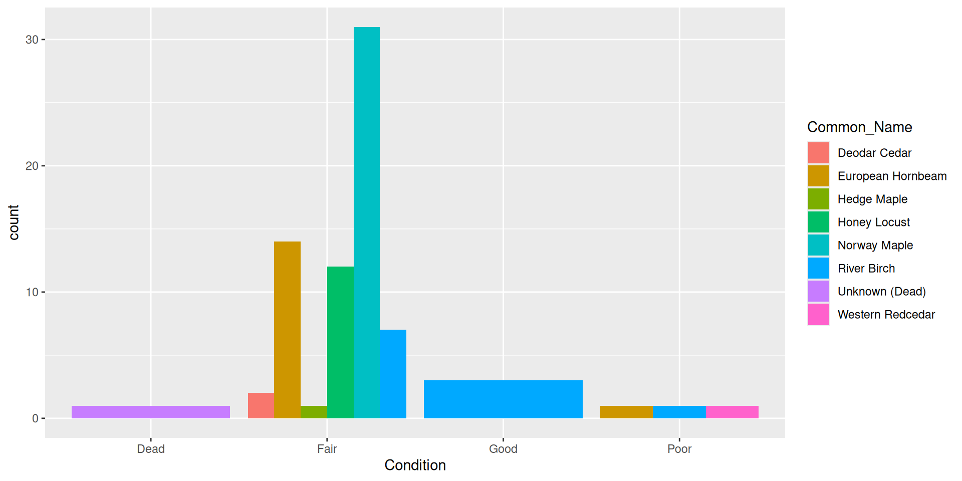
Alternative: dodging bars

Alternative: filling bars

Question: why choose a position filled vs position stacked barplot
Comparision
Comparision: stacked, filled, and dodged


Stacked

Stacked

Filled

Dodged
Histograms
Histograms
Multiple variables in histograms
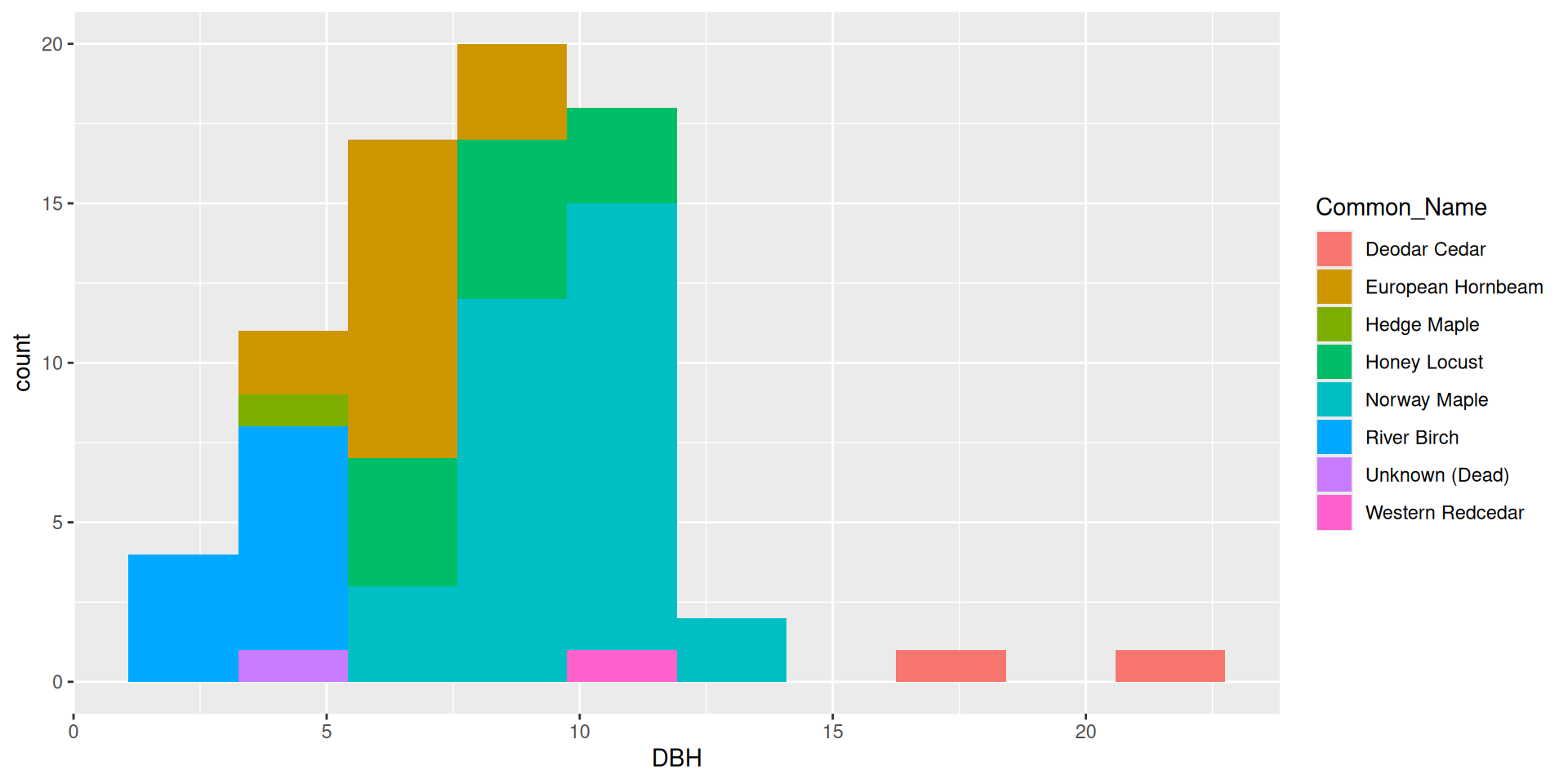
In general, it is very hard to interpret histograms with anything besides position = "stack"
Multiple variables in histograms
Bad idea!
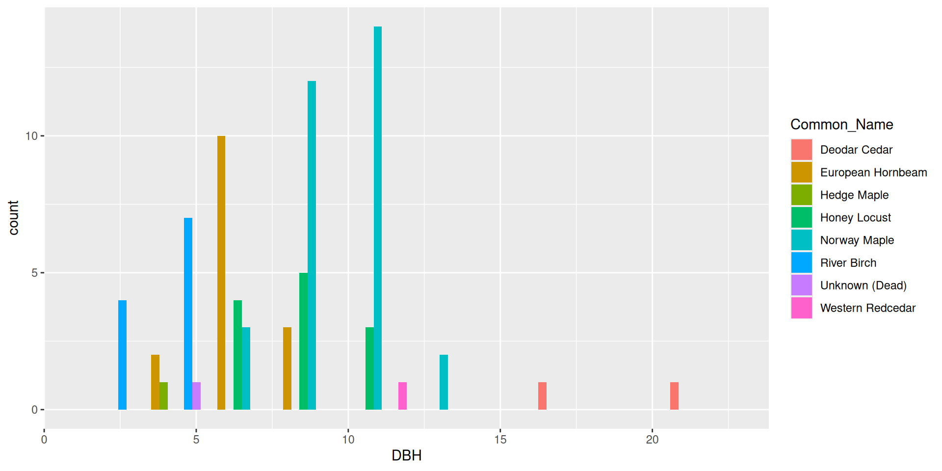
Multiple variables in histograms
Bad idea!
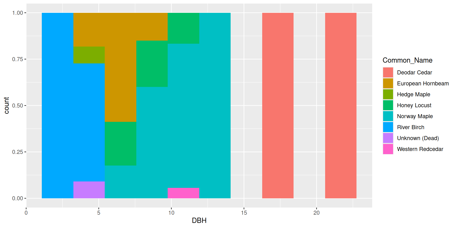
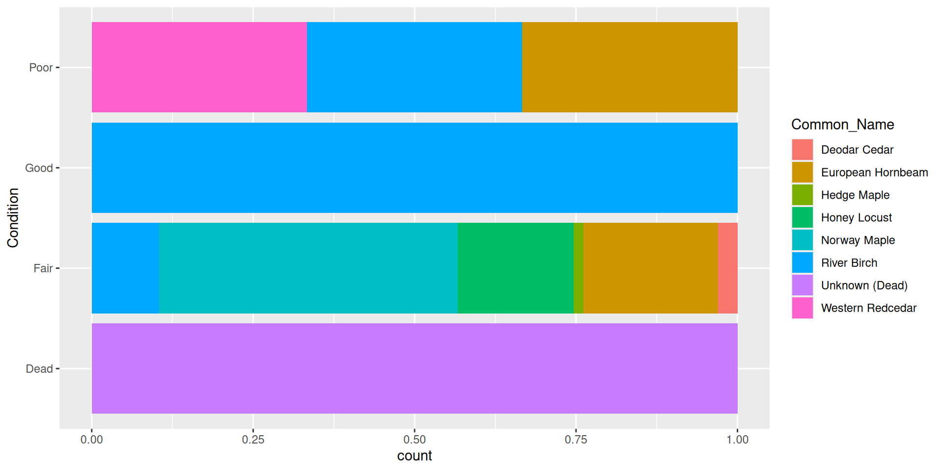
Flipping the coordinate system
Flipping the coordinate system
In ggplot2, it is quite easy to “flip” a coordinate system.
This is often done for aesthetic purposes.
This function works on many, if not all, geoms.
The function is coord_flip(). Let’s take a look at it
Flipping the coordinate system

Flipping the coordinate system
Flipping the coordinate system: boxplot
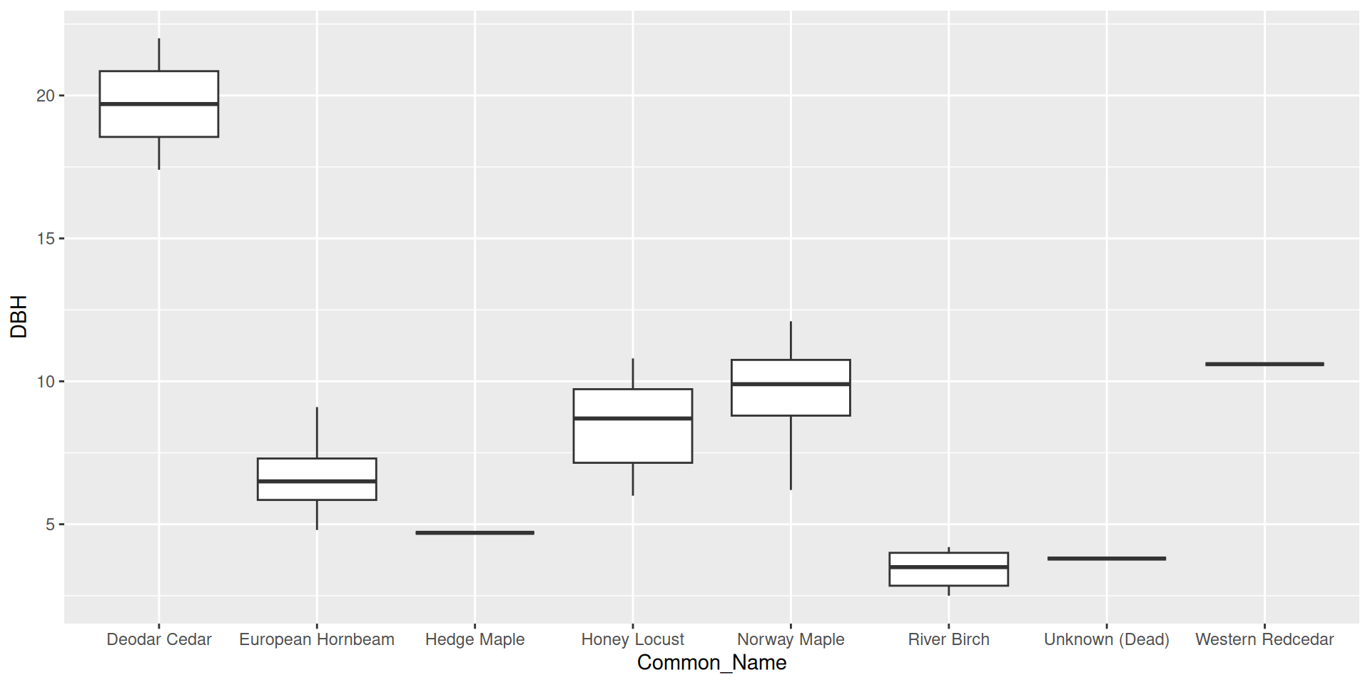
Flipping the coordinate system: boxplot

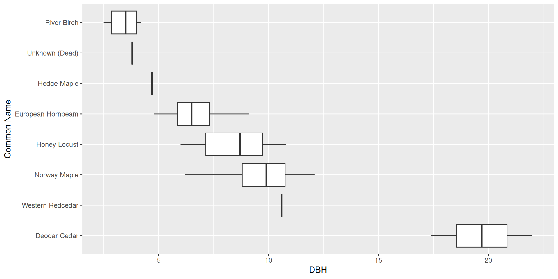
What if we wanted to reorder these common names from least to greatest DBH?
Reordering ggplot2 output
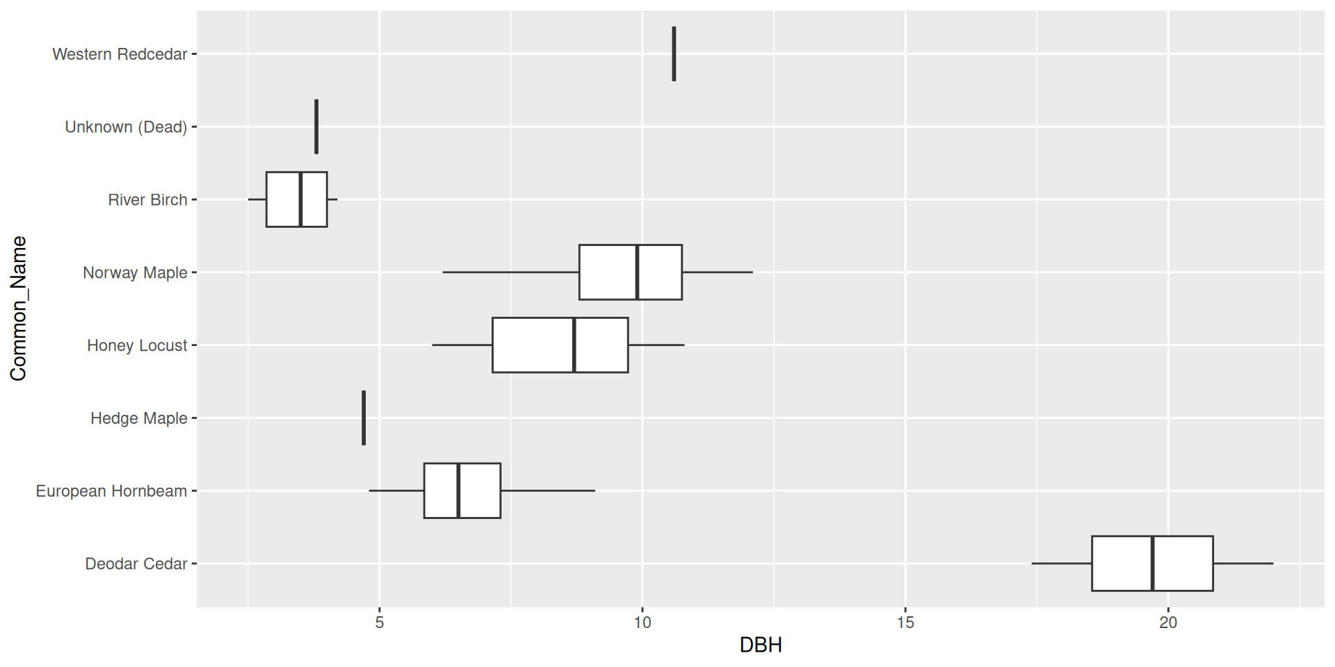
Reordering ggplot2 output by a particular variable
Use the fct_reorder() function from forcats.
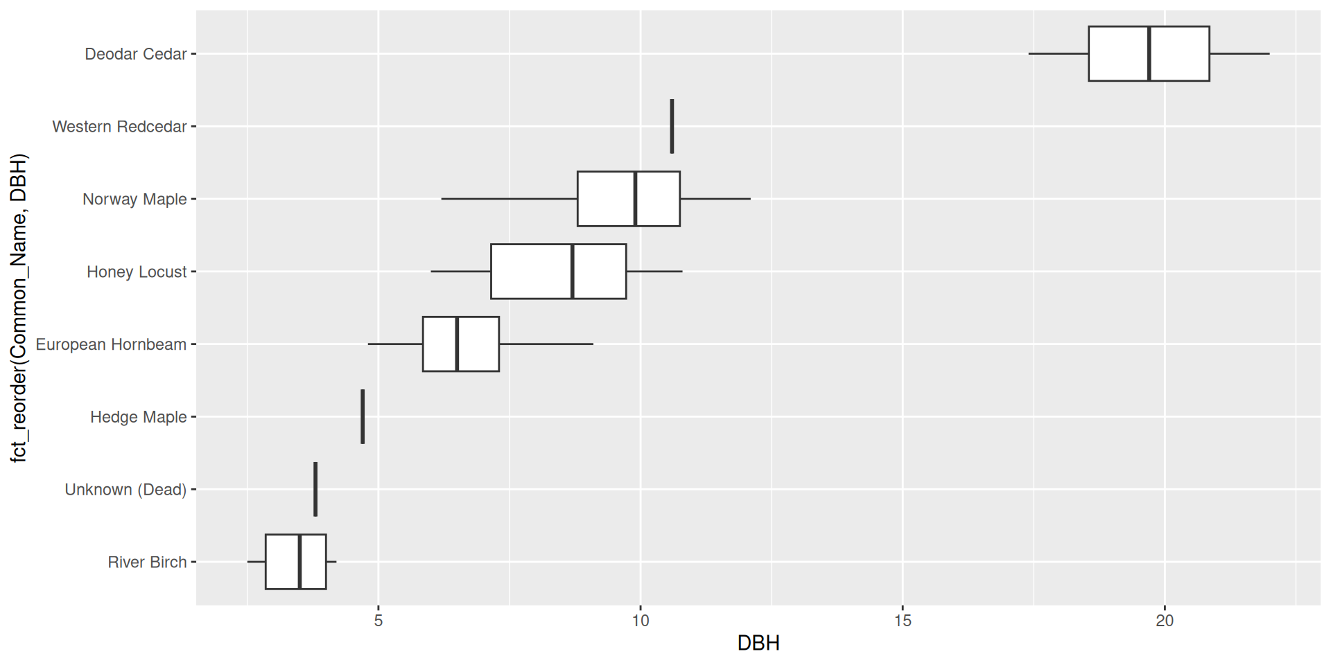
Reordering ggplot2 output by a particular variable
Set .desc = TRUE to reverse the order
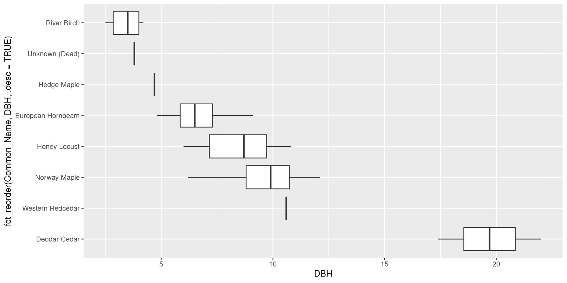
Reordering ggplot2 output by a particular variable
Make sure to rename the axis!

Reordering ggplot2 output by a particular variable
Question: why did I specify x here rather than y?
A deep dive into scales
Scales
Recall, we defined scales as “how data are mapped to certain aesthetics”.
We will expand that definition now.
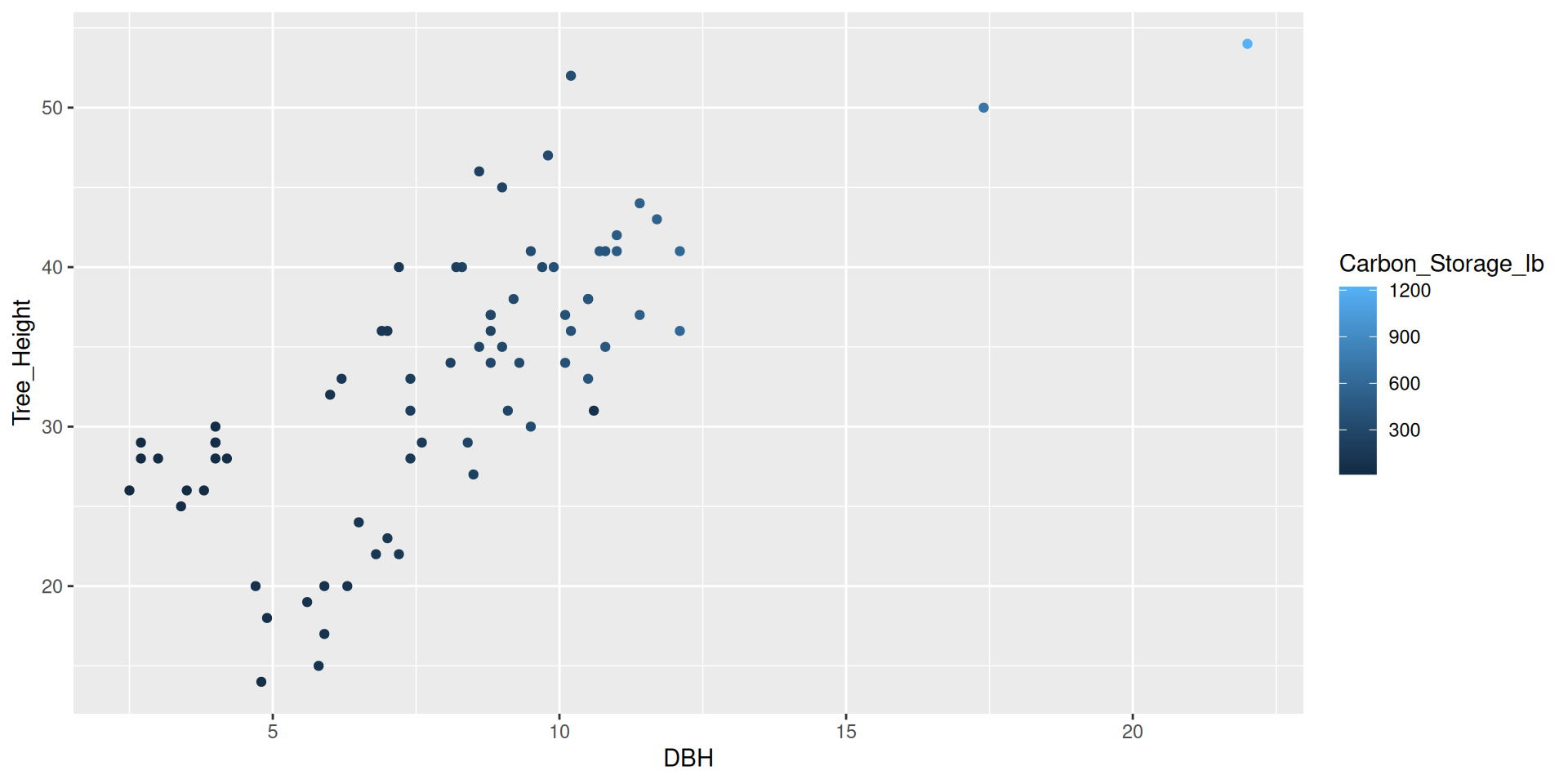
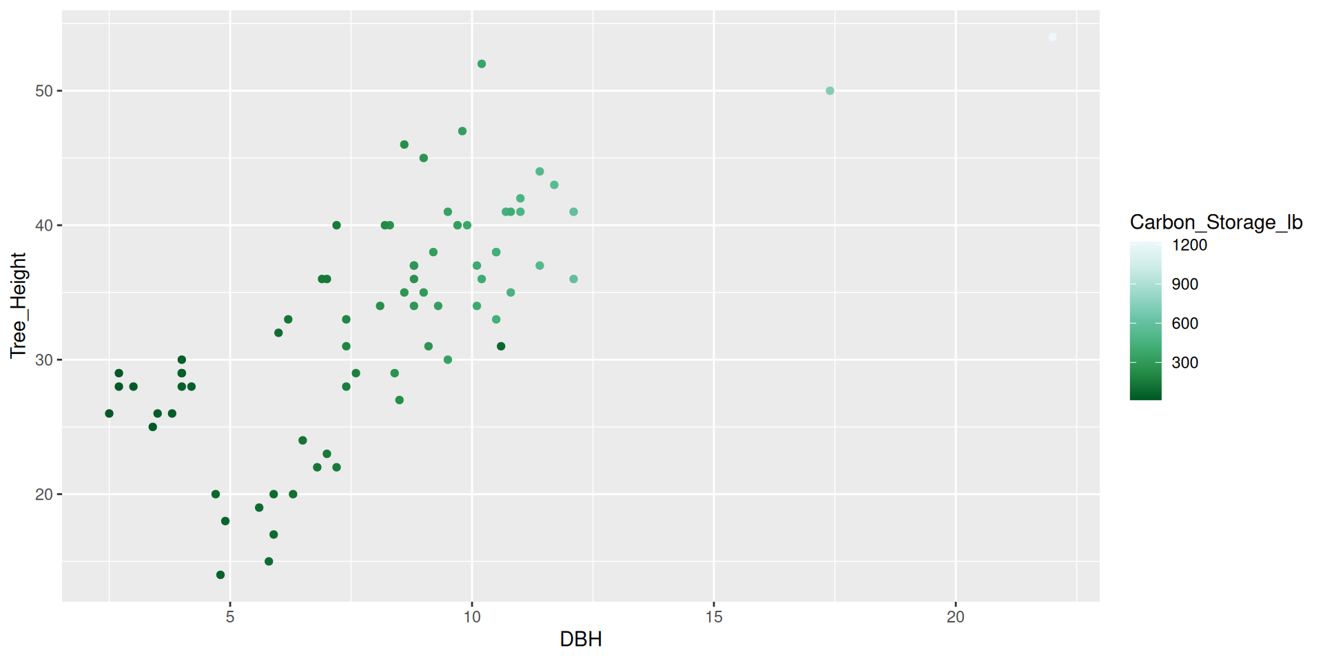
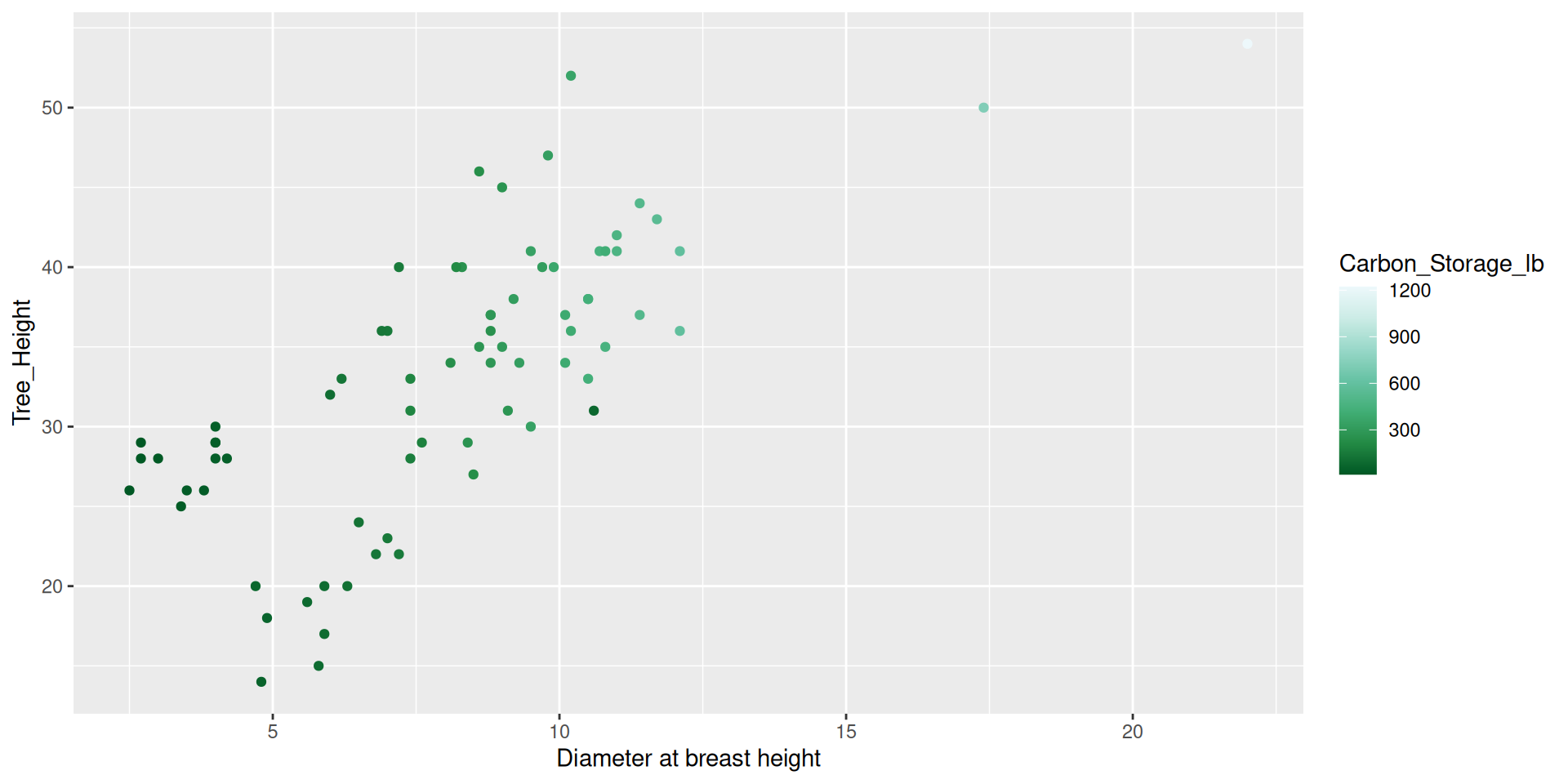
Scales not only encompass things like shape and color, but also the title, labels, and how we set, break the axis and color/fill scales. ## Modifying scales
Scales
Modifying scales
Modifying scales
Modifying scales
Modifying scales
Modifying scales
Modifying scales
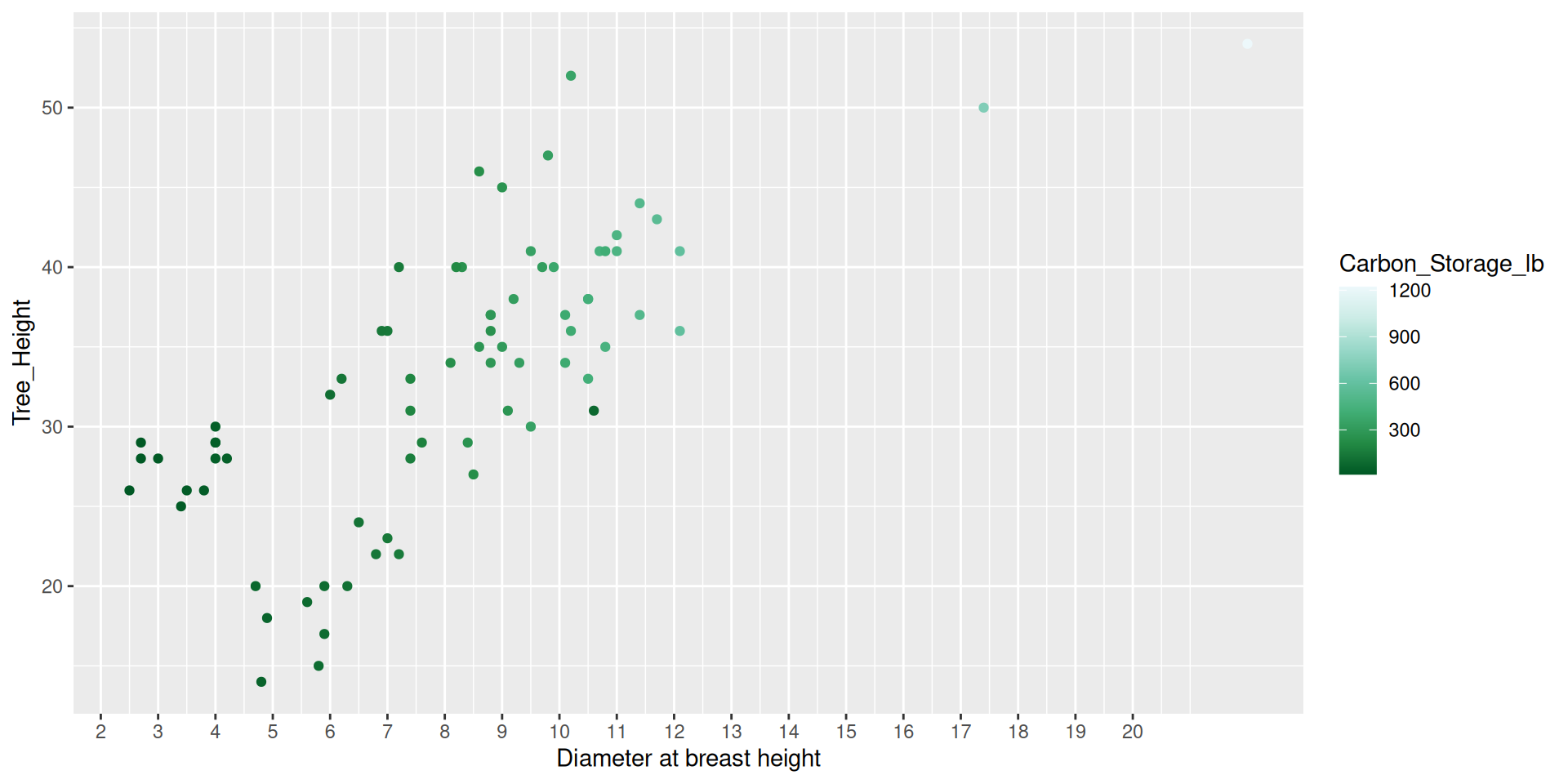
Modifying scales
Modifying scales
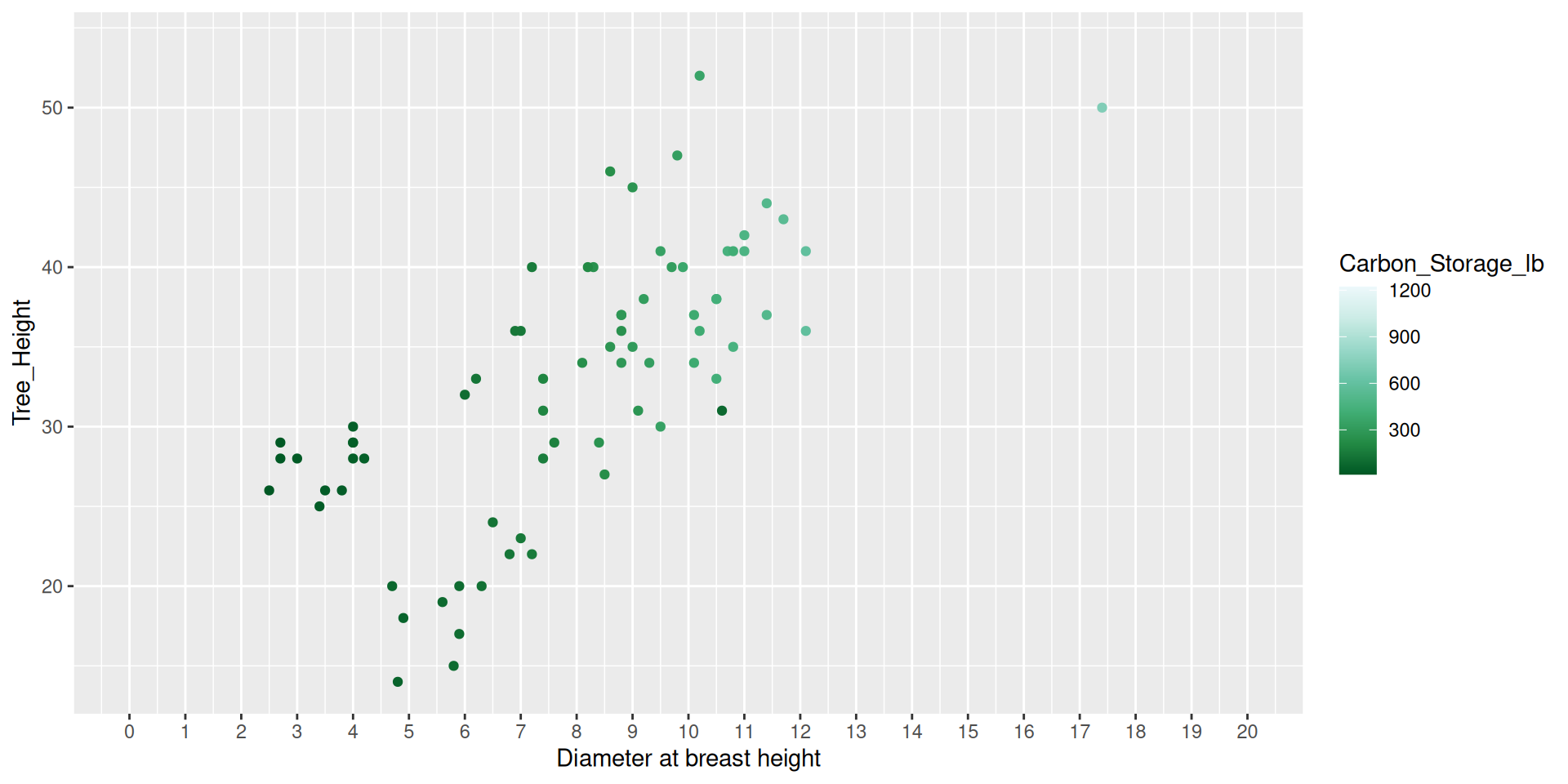
Modifying scales
Modifying scales

Modifying scales
Modifying scales

Guides (part of the theme)
Guides
Guides, a part of the theme of the graphic, are used to display the values associated with a given color or fill aesthetic.
Guides
Guides
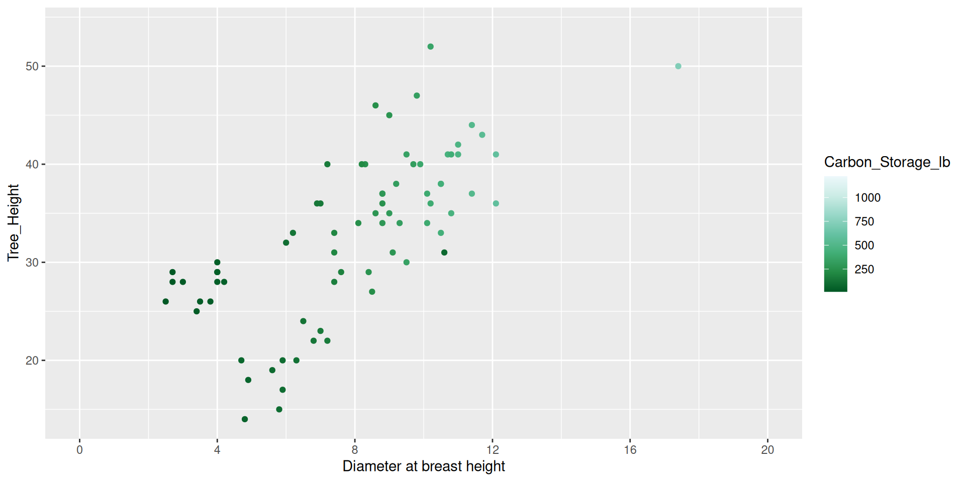
Modifying guides
dat %>%
  ggplot() +
  geom_point(aes(x = DBH,
                 y = Tree_Height,
color = Carbon_Storage_lb)) +
scale_color_distiller(type = "seq", palette = 2,
breaks = c(250, 500, 750, 1000, 1250),
guide = guide_colorbar(barheight = 15,
barwidth = 1)) +
scale_x_continuous(name = "Diameter at breast height",
breaks = seq(0, 20, by = 4),
limits = c(0,20))Modifying guides
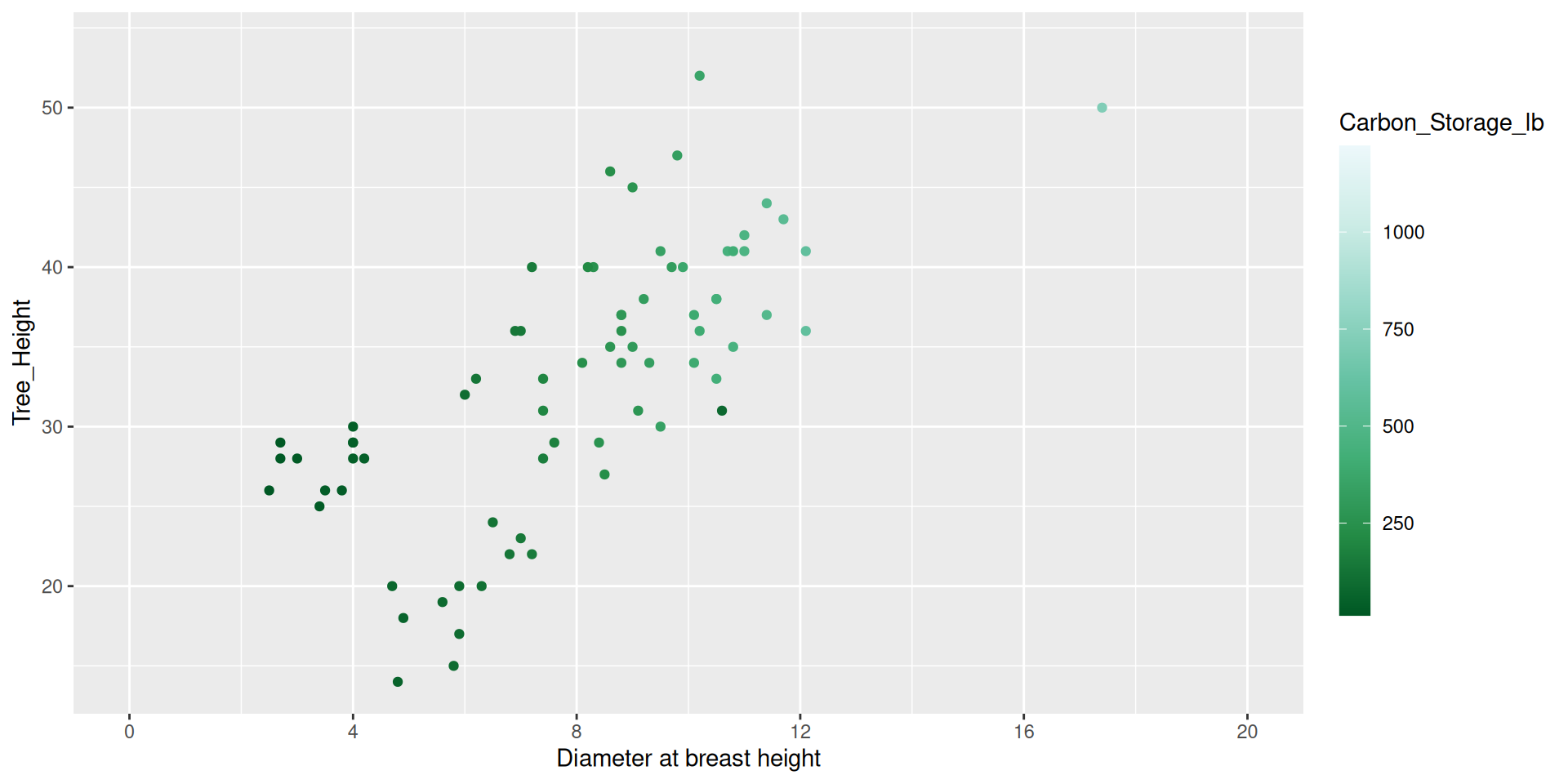
Modifying guides
dat %>%
  ggplot() +
  geom_point(aes(x = DBH,
                 y = Tree_Height,
                 color = Carbon_Storage_lb)) +
  scale_color_distiller(type = "seq", palette = 2,
                        breaks = c(250, 500, 750, 1000, 1250),
                        guide = guide_colorbar(barheight = 1,
                                               barwidth = 15,
                                               position = "bottom")) +
  scale_x_continuous(name = "Diameter at breast height",
                     breaks = seq(0, 20, by = 4),
                     limits = c(0,20))
Modifying guides
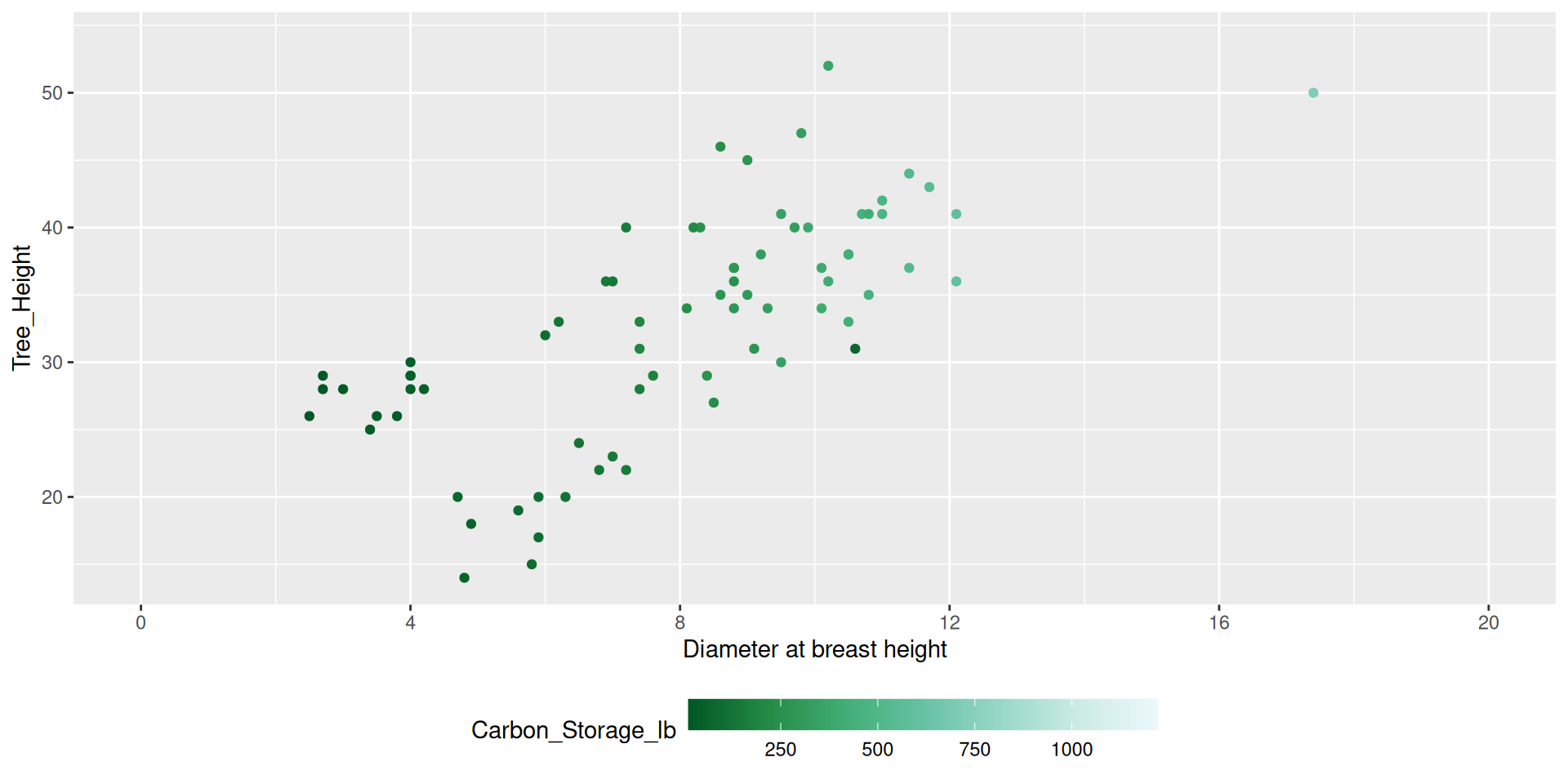
Modifying guides
dat %>%
  ggplot() +
  geom_point(aes(x = DBH,
                 y = Tree_Height,
                 color = Carbon_Storage_lb)) +
  scale_color_distiller(type = "seq", palette = 2,
                        breaks = c(250, 500, 750, 1000, 1250),
                        guide = guide_colorbar(barheight = 1,
                                               barwidth = 15,
                                               position = "bottom")) +
  scale_x_continuous(name = "Diameter at breast height",
                     breaks = seq(0, 20, by = 4),
                     limits = c(0,20)) +
  theme(legend.title.position = "top",
        legend.title = element_text(hjust = 0.5))
Modifying guides
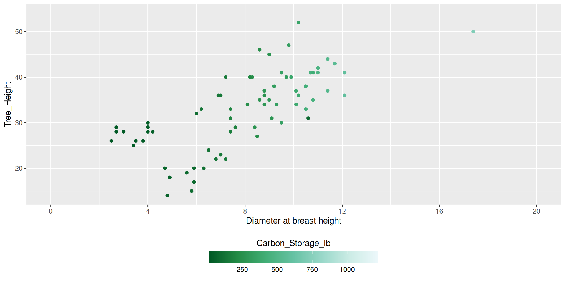
Next time
- Building graphics incrementally,
- Arranging graphics,
- Saving graphics,
- Spatial data with
sf - Spatial plotting with
ggplot2+sf

